The Law of Proximity in Product Design: Enhancing User Experience
Things placed close together are read as related.

Definition of Law of Proximity
The Law of Proximity, one of the Gestalt principles, originated in the early 20th century as German psychologists sought to explain how the human mind perceives visual information. This principle states that objects or elements placed nearby are naturally perceived as forming a collective or having a meaningful relationship. It highlights the human tendency to organize visual stimuli into coherent groups based on their spatial closeness.
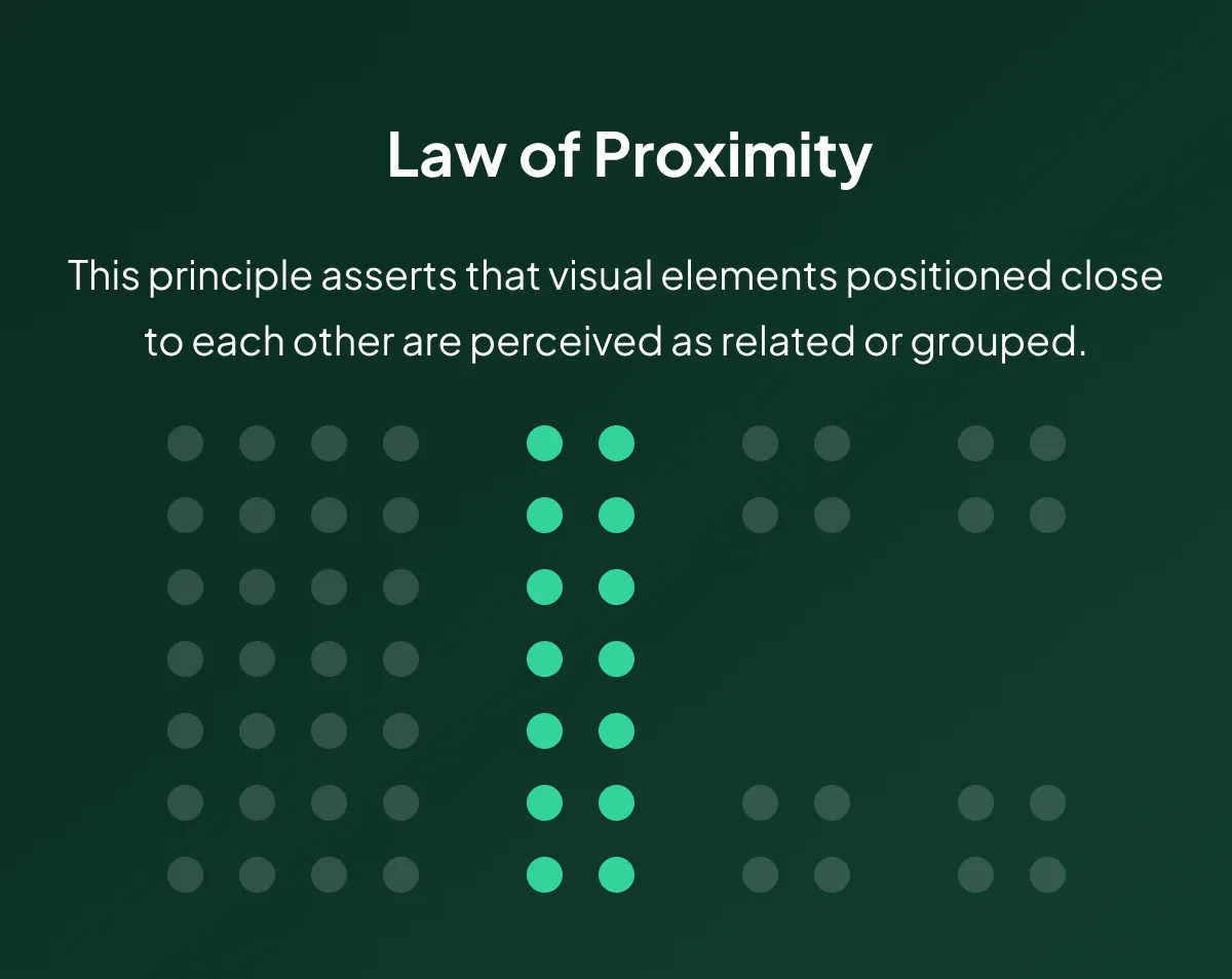
The Law of Proximity — Definition
Importance in Product Design
In the context of product design, the Law of Proximity holds immense significance. The core purpose is to facilitate efficient information processing for users, promoting a smooth and intuitive interaction with the product. Here’s why it matters:
1. Organized Perception
Proximity aids in structuring information, allowing users to grasp relationships between different elements on the interface quickly. Users are more likely to comprehend the layout and functionalities of a product when related elements are visually grouped together. This organized perception contributes to a more intuitive user experience.
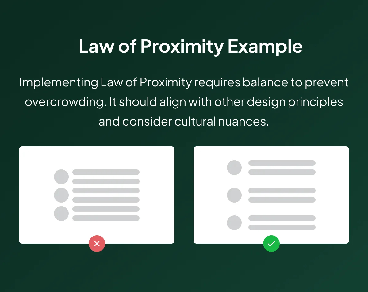
Law of Proximity Example for Product Design Use
2. Reduced Cognitive Load
Grouping related elements minimizes the mental effort required for information processing. By reducing cognitive load, designers enhance the usability of the product. Users can focus on the task at hand without being overwhelmed by scattered or disorganized information.
3. Intuitive Navigation
Proximity is a visual cue for users, guiding them through the interface effortlessly. It establishes a clear path, reducing the chances of user confusion and frustration.
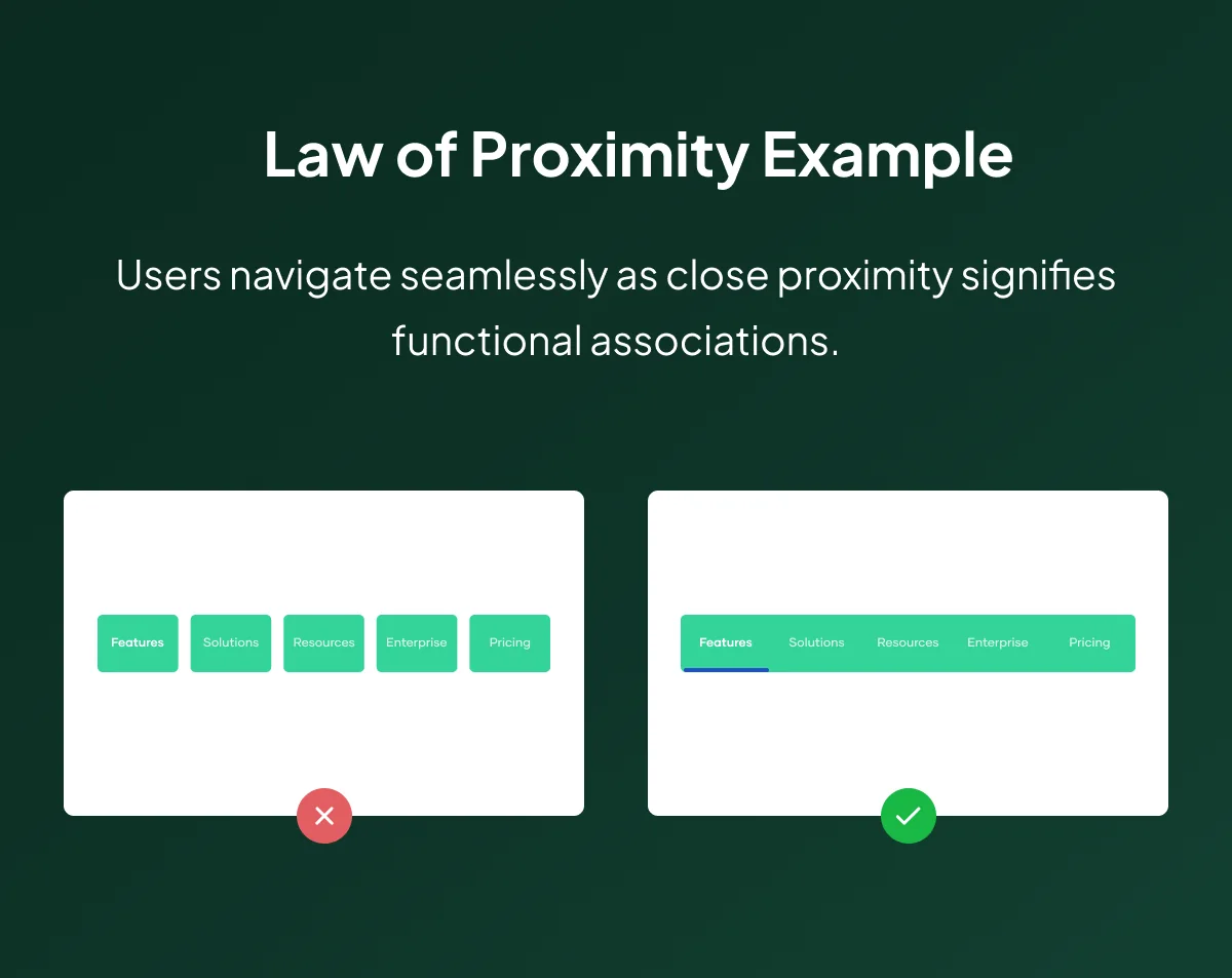
Navigation Example for the Proximity Principle
4. Enhanced Visual Hierarchy
Proximity contributes to an effective hierarchy, directing attention and prioritizing information. Designers use proximity to create a visual hierarchy, ensuring that users first notice and engage with essential elements. This enhances the overall user flow and experience.
5. Responsive Design Consideration
Considering proximity becomes paramount in the era of diverse devices and screen sizes. Designers must ensure that the grouping of elements remains effective and visually cohesive across different platforms.
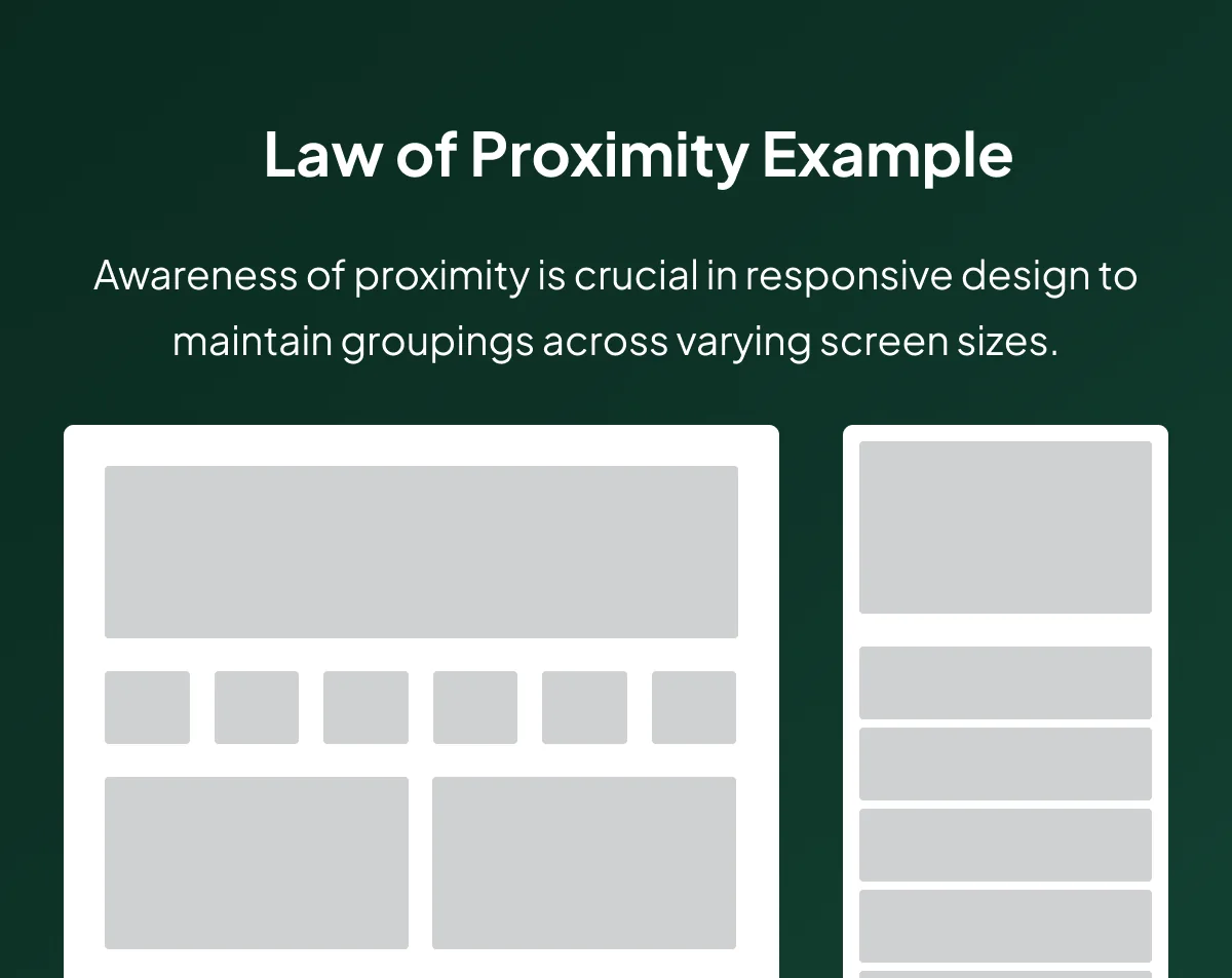
Responsive Design Example
Additional Thoughts
While harnessing the power of proximity is integral, it demands a delicate balance. Designers must avoid overcrowding, as too many elements nearby can make the interface look cluttered and confusing. Achieving a harmonious balance between proximity and white space is key to creating visually appealing and organized layouts.
Cultural considerations also come into play. What may be an intuitive grouping in one cultural context might not hold the same clarity in another. Designers must be mindful of cultural nuances to ensure the product’s visual organization is universally effective.
Examples of Use
1. Slack
Clear interface organization enhances communication.

Law of Proximity on Slack’s Interface
2. Asana
Logical proximity aids task management.

Law of Proximity on Asana's Interface
3. Trello
Visual hierarchy for efficient project management. Important information, such as the name of the board and lists of cards, is prominently displayed, enhancing user experience.

Law of Proximity on Trello's Interface
4. Zoom
Grouping features for intuitive video conferencing. The Law of Proximity contributes to a user-friendly interface, facilitating smooth video conferencing experiences.
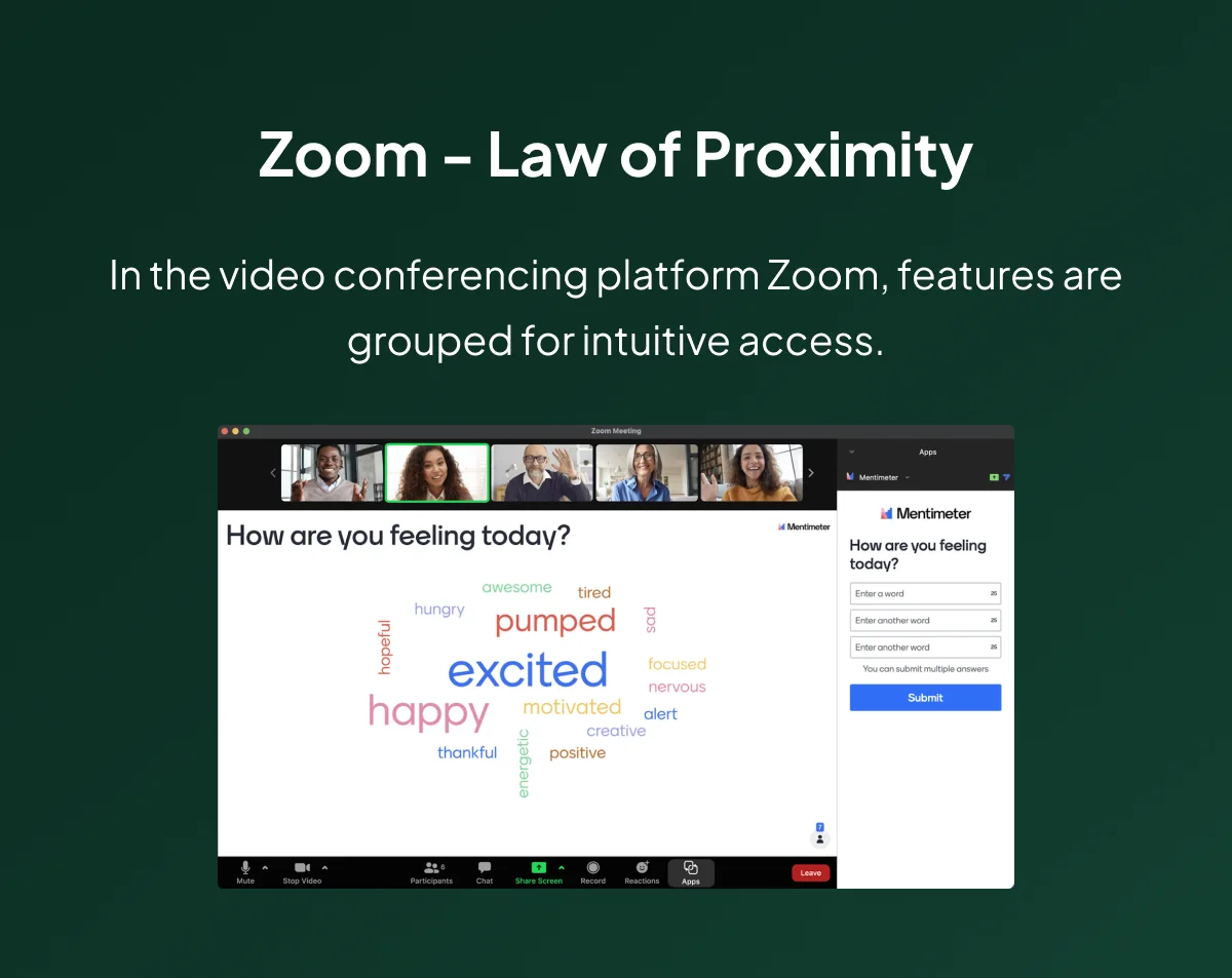
Law of Proximity on Zoom's Interface
5. Duolingo
Close proximity guides users through language learning paths. Elements related to language learning are visually grouped, enhancing the user’s educational path.

Law of Proximity on Duolingo's Interface
Law of Proximity in Business and Marketing
The Law of Proximity is a powerful tool for creating visually coherent and engaging experiences in business and marketing. Designers strategically position related products or services close to each other, optimizing consumer engagement.
This principle fosters intuitive website navigation, simplifying user interactions and boosting conversion rates. By ensuring that visually related elements are proximate, businesses can enhance the overall user experience, making it more likely for users to explore and engage with products or services.
Feel free to reach out for further guidance on integrating these principles into your design endeavors. At I work with teams on decisions like this one.
Follow me here and on my Medium page for continuous insights and updates on design principles and user experience.
Happy designing!
If you're weighing a decision like this on a live product, here's how I work with teams.
Part of the UX laws worth knowing — seventeen principles grouped by the decision each one helps you make.
Common questions
What is the Law of Proximity?
One of the Gestalt principles, formulated by German psychologists in the early 20th century: elements placed close together are perceived as belonging to the same group, whether or not they are actually related.
Why does the Law of Proximity matter in product design?
It decides how quickly someone can process an interface. Grouping related controls and separating unrelated ones lets a user find what they need without reading every element, which is most of what makes a layout feel obvious.
How do you apply the Law of Proximity without overcrowding?
Spacing is the tool, not the constraint. Bring related items close enough to read as a set, and leave enough room between sets that the boundary is visible. Too many elements packed near each other produces the opposite effect: nothing reads as grouped.