Power of Common Region in User-Centric Product Design
A shared background does what spacing alone cannot.
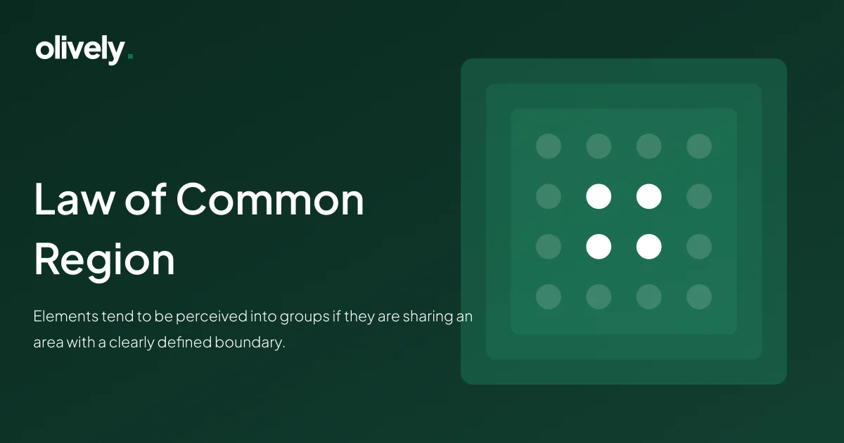
Understanding the Law of Common Region
At its core, the Law of Common Region encapsulates the idea that visual elements, when enclosed within a clear boundary, form a cohesive unit in the user’s perception. This principle builds on the Gestalt principles, providing designers with a powerful tool to orchestrate visual harmony.
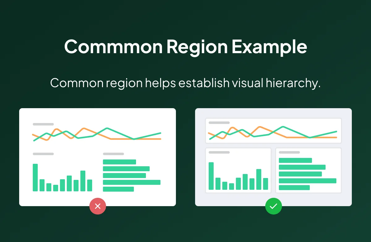
Common region helps establish visual hierarchy
Importance in Product Design
In the changing landscape of digital product design, the Law of Common Region stands as a guide of clarity. Its application fosters a structured visual hierarchy, allowing users to navigate interfaces swiftly. By using borders, background colors, or shadows, designers create tangible relationships between elements, enhancing user understanding and interaction. This isn’t merely an aesthetic choice; it’s a strategic move to reduce cognitive load and streamline the user path.
Balancing Act
While the benefits are deep, designers must tread carefully. Overuse of borders or backgrounds meant to establish common regions can lead to clutter. It’s imperative to assess whether a visual cue is necessary for clear grouping or if whitespace alone can convey the intended message.
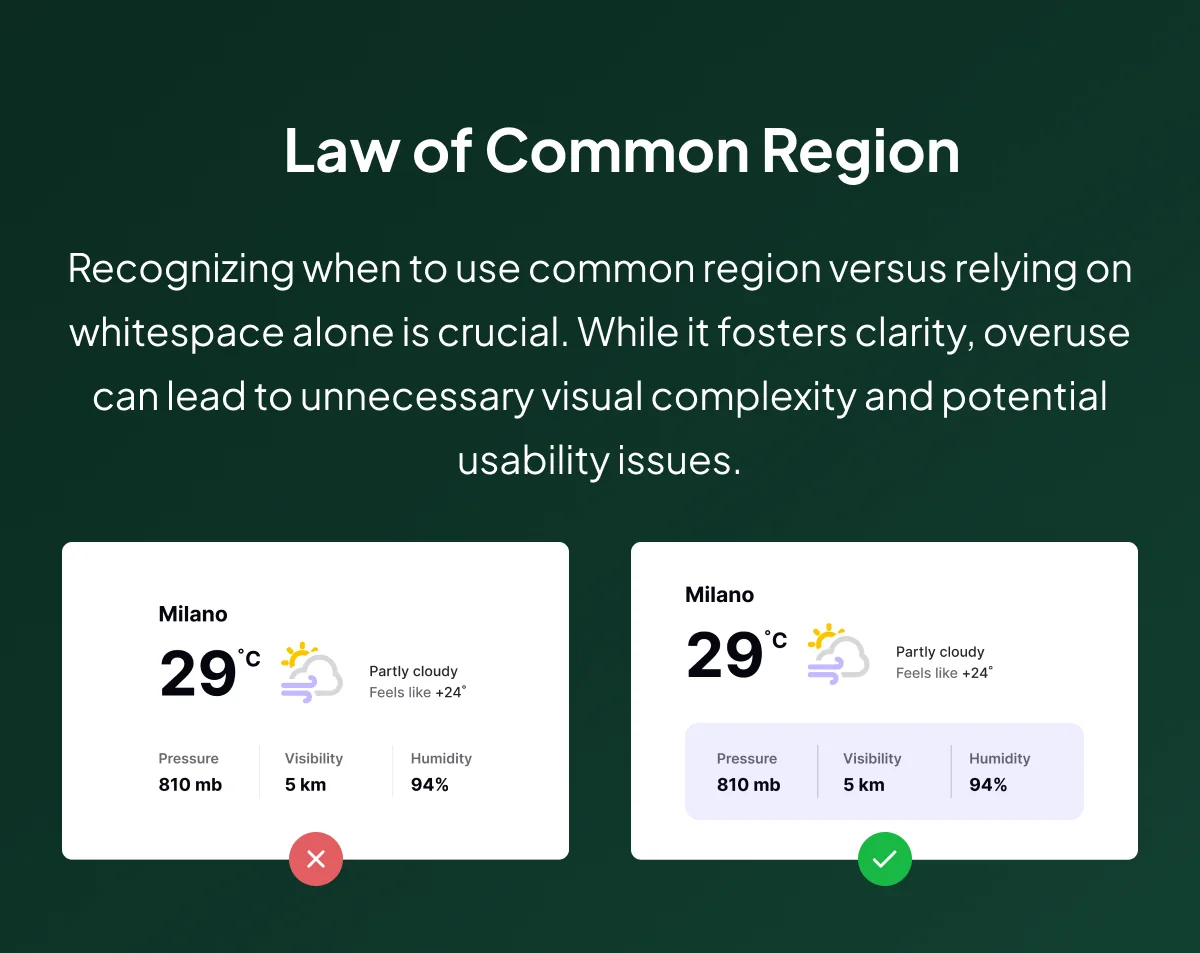
Tips on Using the Law of Common Region in Product Design
Key Takeaways
- Visual Structure: Common Region is an architect who shapes a clear and organized structure within digital interfaces. Users effortlessly discern sections and their relationships.
- Effective Grouping: Borders and background colors act as visual cues, signaling related elements. This promotes a smooth flow and intuitive comprehension.
- Hierarchy Establishment: From app layouts to webpage content, Common Region aids in establishing a hierarchy guiding users to focal points and essential information.
- Reducing Clutter: While a potent tool, it must be wielded judiciously. Overuse can lead to visual clutter. The challenge lies in finding the delicate balance between clarity and simplicity.
- Enhanced Usability: The judicious application of Common Region improves usability by minimizing confusion, reducing interaction effort, and fostering a positive user experience.
Working in the Design Landscape
In practical terms, platforms like Twitter use the Law of Common Region to group tweets within a timeline, enhancing readability.
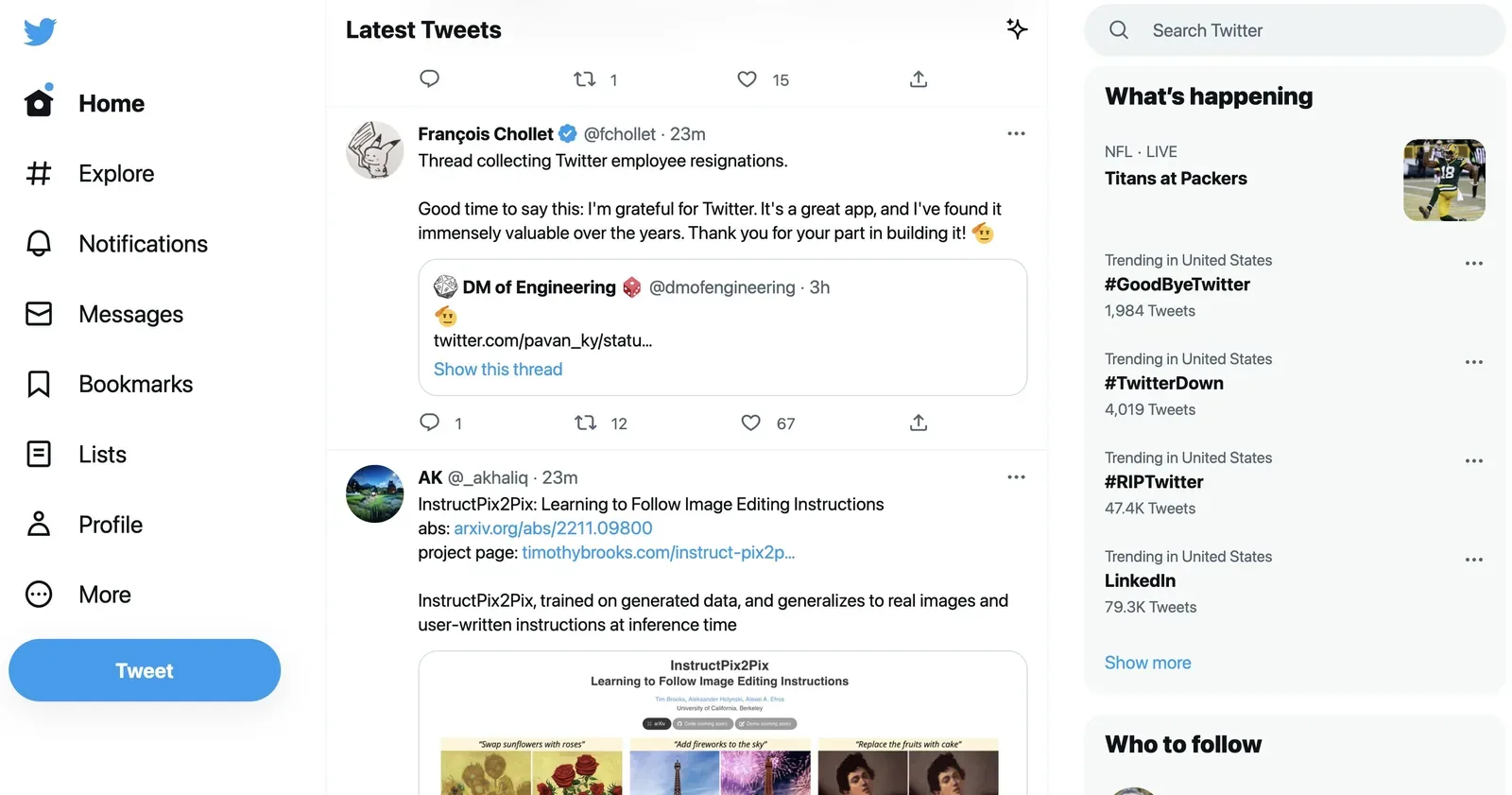
Twitter and the Law of Common Region in Product Design
Pinterest employs it to delineate boards, aiding content organization.
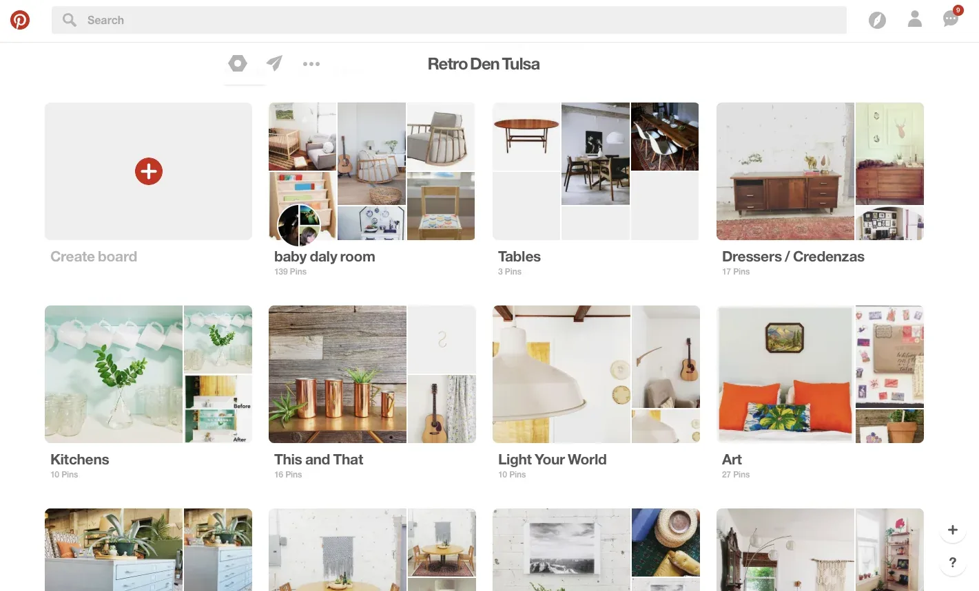
Pinterest and the Law of Common Region in Product Design
Dropbox
Dropbox uses this principle to create folders, ensuring file organization is intuitive.

Dropbox and the Law of Common Region in Product Design
LinkedIn and Uber
Platforms like LinkedIn and Uber strategically apply Common Region to delineate and emphasize various sections within their interfaces.

LinkedIn and the Law of Common Region in Product Design
Conclusion
In the symphony of design, the Law of Common Region harmonizes visual elements, creating a melody of clarity and user understanding. As designers, embracing this principle equips us to craft interfaces that captivate aesthetically and guide users cleanly through their digital path. In the intricate dance of pixels and perception, the Law of Common Region emerges as a maestro, conducting a symphony of usability and delight.
Feel free to reach out for further guidance on integrating these principles into your design endeavors.I work with teams on decisions like this one.
Follow me here and on my LinkedIn page for continuous insights and updates on design principles and user experience.
Happy designing!
If you're weighing a decision like this on a live product, here's how I work with teams.
Part of the UX laws worth knowing — seventeen principles grouped by the decision each one helps you make.
Common questions
What is the principle of common region?
Elements placed inside a shared boundary — a card, a panel, a bordered area — are perceived as belonging together, even when they are further apart than elements outside it.
How does common region compare to proximity?
A boundary overrides distance. Two items inside the same card read as related even when spaced apart, while two items close together but separated by a border do not.
Where should you use common region?
Where grouping needs to be unambiguous and space is tight, or where the grouping has to survive a responsive layout that changes the spacing between elements.