The Law of Similarity in Product Design
Things that look alike are read as doing alike.
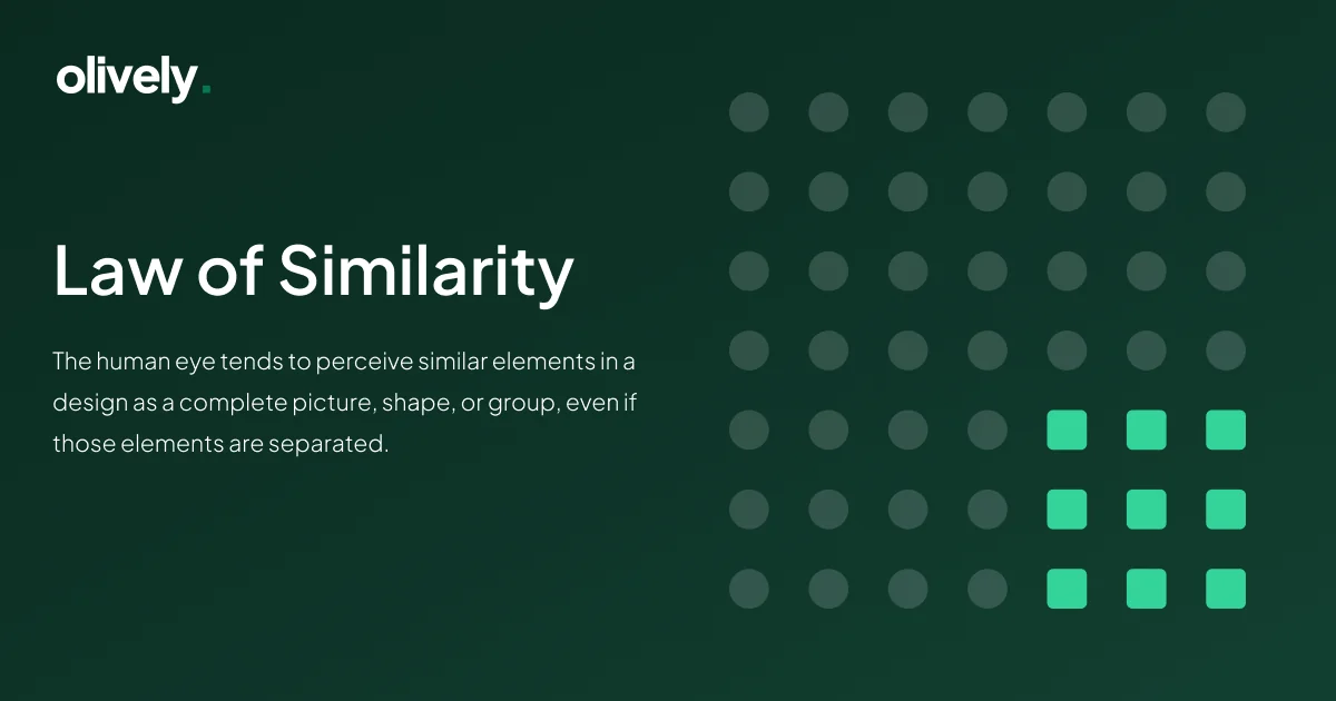
Defined by Gestalt psychologists in the early 20th century, the Law of Similarity says that elements sharing a visual trait — colour, shape or size — are perceived as related. Understanding it is most of what makes an interface readable rather than merely tidy.
Understanding the Law of Similarity
The Law of Similarity is a consequence of how the brain organises and categorises visual information. Applied in design, it becomes a way to guide someone through an interface without instruction.
Imagine a page where buttons of varying colours and shapes are scattered at random. Working out which of them do the same kind of thing is a puzzle the user has to solve before they can act. Under the Law of Similarity, elements with shared traits become signposts instead — a visual language the eye reads before conscious attention arrives.
Why it matters in product design
Usability
Similarity lets someone grasp what an element does without being told. Buttons of the same shape convey the same class of action, which flattens the learning curve for anyone navigating the interface for the first time.
Visual hierarchy
Used consistently, size, colour and shape establish a hierarchy. That helps a reader prioritise — understanding not just what is on the page but which parts of it matter more.
Cognitive load
Grouping similar elements reduces the work of interpretation. The fewer distinct things there are to categorise, the less effort it takes to move through a screen.
Consistent branding
The effect runs past usability into recognition. Shared visual traits produce a coherent identity across a suite of applications or across sections of one site, which is what makes a product recognisable at a glance.
Efficient communication
Design is a language, and similarity is one of its grammatical rules. It conveys relationships between elements, so a person can anticipate what a component does from how it looks.
How large products use it
Adobe Creative Cloud. Consistent icons and colour schemes across applications produce one experience rather than a collection of separate tools.
Slack. Similar shapes and colours for channels and messages establish a clear hierarchy, which is much of what makes team communication legible at speed.
Pinterest. Consistency across an endless grid is what allows uninterrupted browsing — the eye never has to stop and re-orient.
LinkedIn. Consistent typography and colour coding let someone distinguish content types quickly, without reading each one to find out what it is.
Snapchat. Consistent icons and colour for interaction buttons mean the controls are found rather than hunted for.
In business and marketing
The principle extends beyond the interface. Brands applying it deliberately produce consistent visual identities across advertising, packaging and online platforms. Shared traits build a memorable presence, and recognition is a large part of what trust is made of.
Where similarity works against you
Similarity groups things, which means it also makes genuinely different things look the same. If a destructive action shares its shape and colour with a routine one, the principle is working exactly as described and producing the wrong result. Differentiation is the other half of the tool: things that behave differently should look different, deliberately and visibly.
Final thoughts
Applying the Law of Similarity is not about making an interface look tidy. It is a structural decision about which things a person should read as related, and it determines how much interpretation the interface asks for before it can be used.
Part of the UX laws worth knowing — seventeen principles grouped by the decision each one helps you make.
Common questions
What is the Law of Similarity?
A Gestalt principle: elements sharing a visual trait — colour, shape or size — are perceived as related, whether or not they actually are.
How do you apply the Law of Similarity in an interface?
Give elements that do the same class of thing the same treatment, so someone can infer what a control does from how it looks rather than by trying it.
When does the Law of Similarity work against you?
When genuinely different things end up looking alike. If a destructive action shares its shape and colour with a routine one, the principle is working correctly and producing the wrong result.