The Doherty Threshold in UX Design
Under 400 milliseconds, attention holds. Over it, it leaks.

Coined in 1982 by Walter J. Doherty and Ahrvind J. Thadani, this principle sets a benchmark for computer response time at 400 milliseconds, aiming to keep users engaged and productive. Let’s look at the significance of the Doherty Threshold in product design, explore critical takeaways, and examine real-world examples.
Understanding the Doherty Threshold
At its core, the Doherty Threshold addresses the delicate balance between user engagement and frustration. It asserts that computer interactions must occur within 400 milliseconds to eliminate the perception of waiting, ensuring users stay immersed and productive. This principle recognizes the human attention span and the impact of response time on the overall user experience.
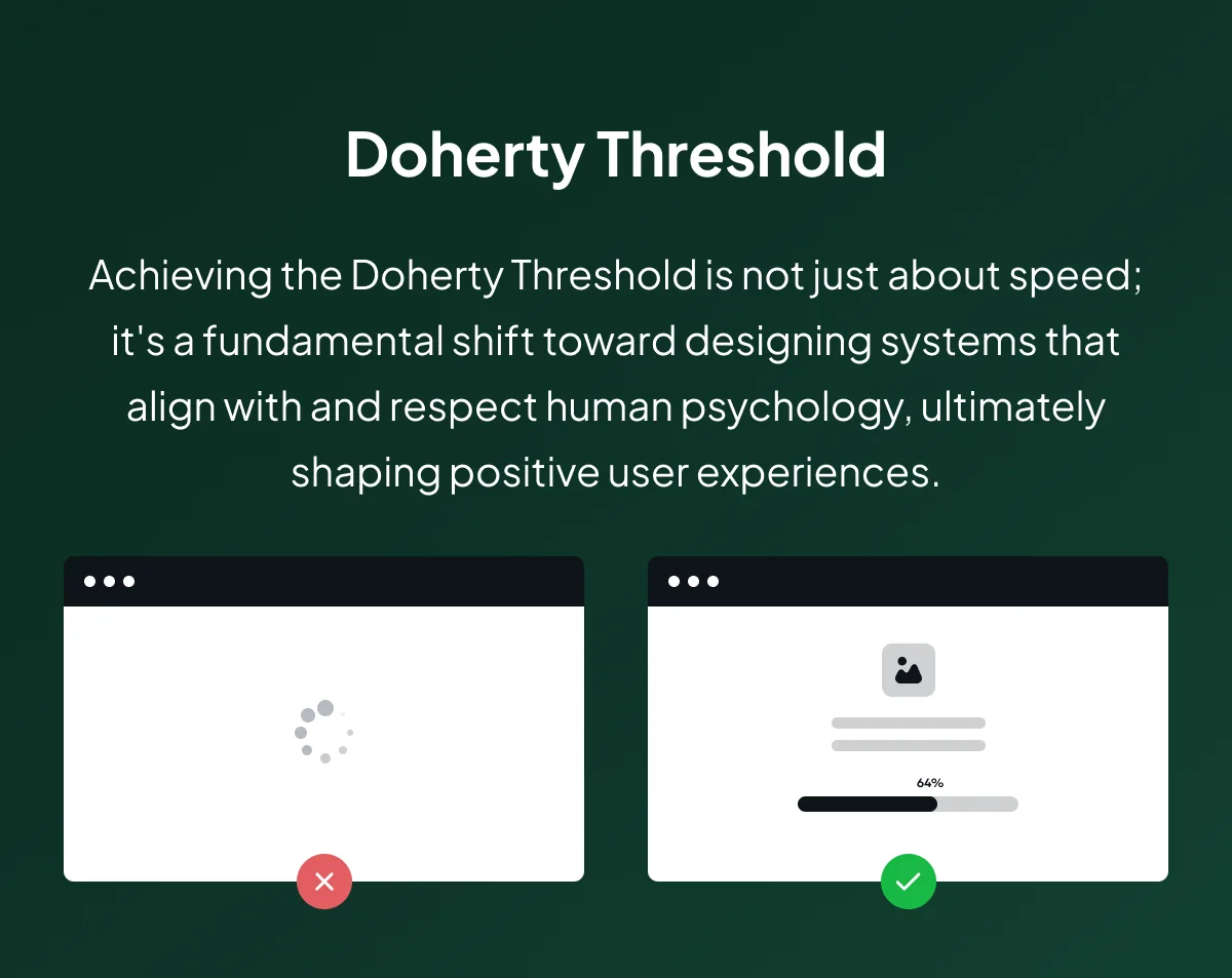
Example of the Doherty Threshold
Why the Doherty Threshold Matters
Implementing the Doherty Threshold in product design is paramount for several reasons. Staying below the 400ms threshold, Swift interaction maintains user engagement, preventing frustration. Perceived performance, achieved through visual cues and loading animations, enhances the user’s sense of immediate response. Adaptive design approaches prioritize simplicity and accommodate varying device capabilities, ensuring a experience that stays out of the way. Constant monitoring and adherence to industry standards guarantee a consistently user-friendly interface, adapting to evolving technological landscapes.
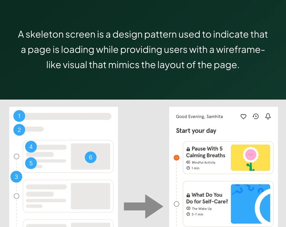
Skeleton Screen Example — Headspace App
Going Beyond Speed
The Doherty Threshold is not merely about speed but a nuanced understanding of human psychology. Designing below the threshold involves creating immediate and fluid experiences, eliminating the painful sensation of waiting. It’s a delicate dance between user satisfaction and potential frustration, emphasizing the importance of timely and efficient interactions.
Key Takeaways
- Swift Interaction: Respond within 400ms to maintain user engagement.
- Perceived Performance: Visual cues mask processing time, enhancing perceived speed.
- Adaptive Design: Prioritize simplicity and adapt to variable device capabilities.
- Constant Monitoring: Regularly assess system performance for iterative improvements.
- Industry Standards: Stay updated with evolving technology for a consistently user-friendly experience.
Real-World Examples
While giants like Google, Amazon, Apple, Netflix, and Tesla epitomize the Doherty Threshold, several other digital innovators exemplify its application:
Deliveroo
The food delivery service engages users by incorporating entertaining loading states during searches. This acknowledges the user’s action and communicates that the system is processing their request.
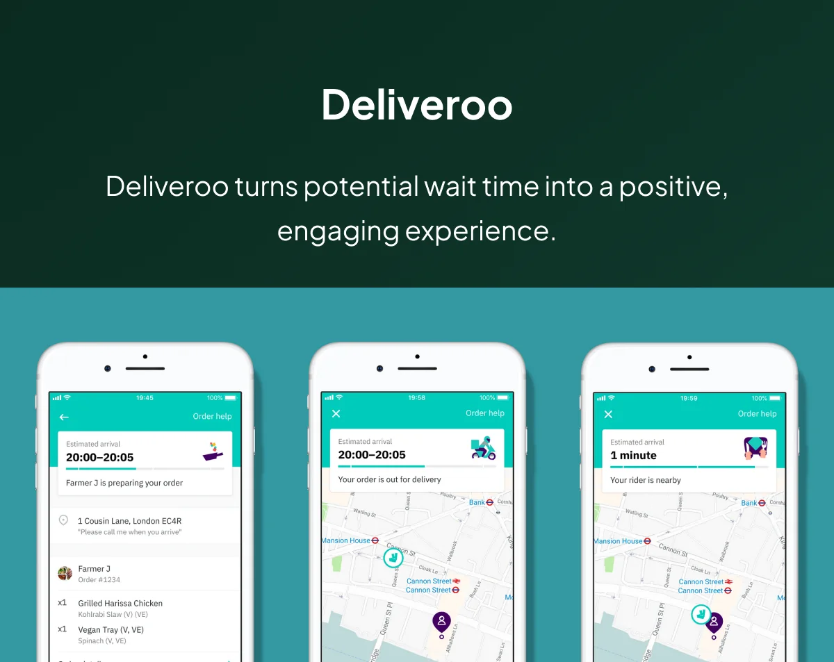
Deliveroo’s User Experience
Slack
Known for its swift response to user inputs, Slack minimizes wait times, ensuring smooth communication and collaboration.
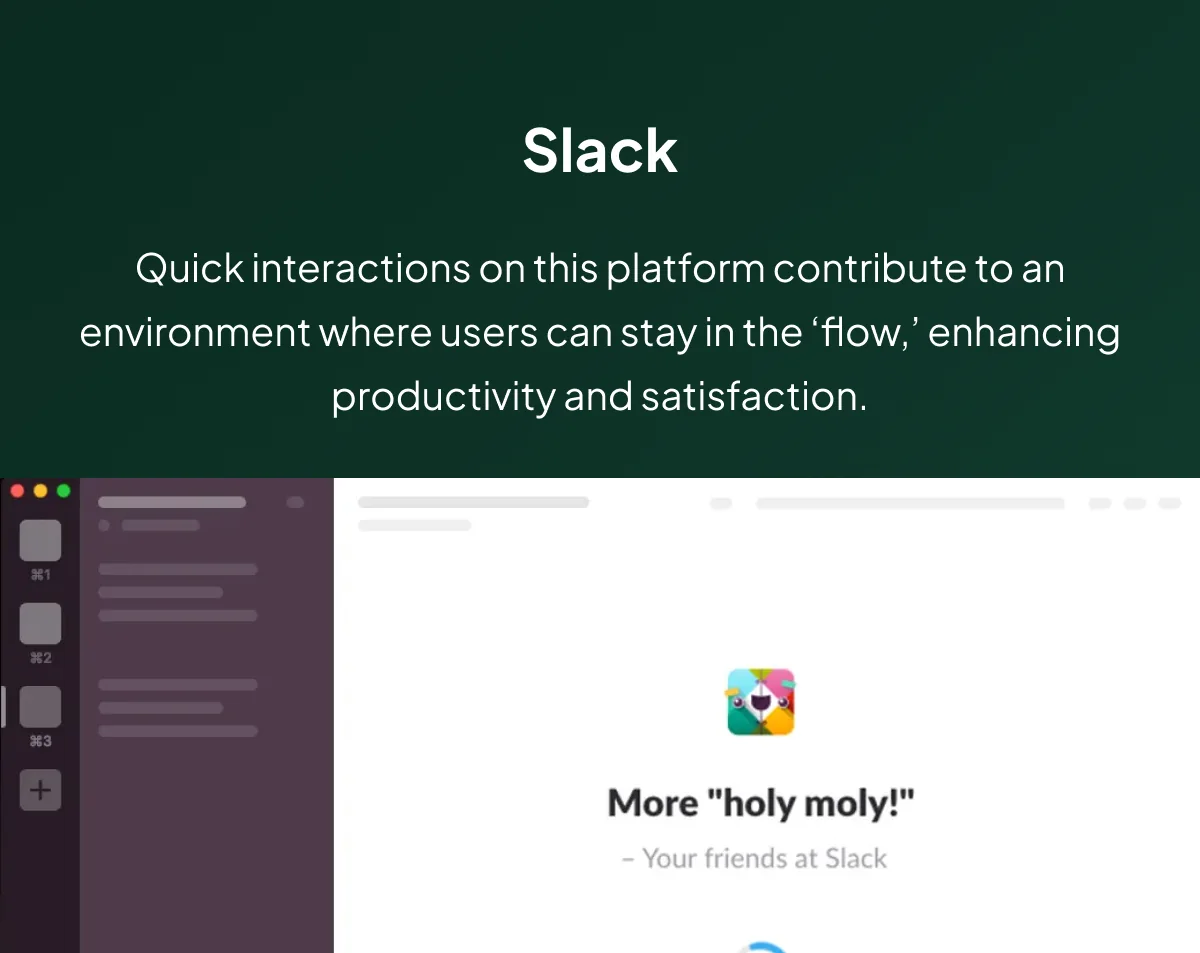
Skeleton Screen on Slack
Uber
The ride-sharing app provides a quick booking confirmation, streamlining the user experience.
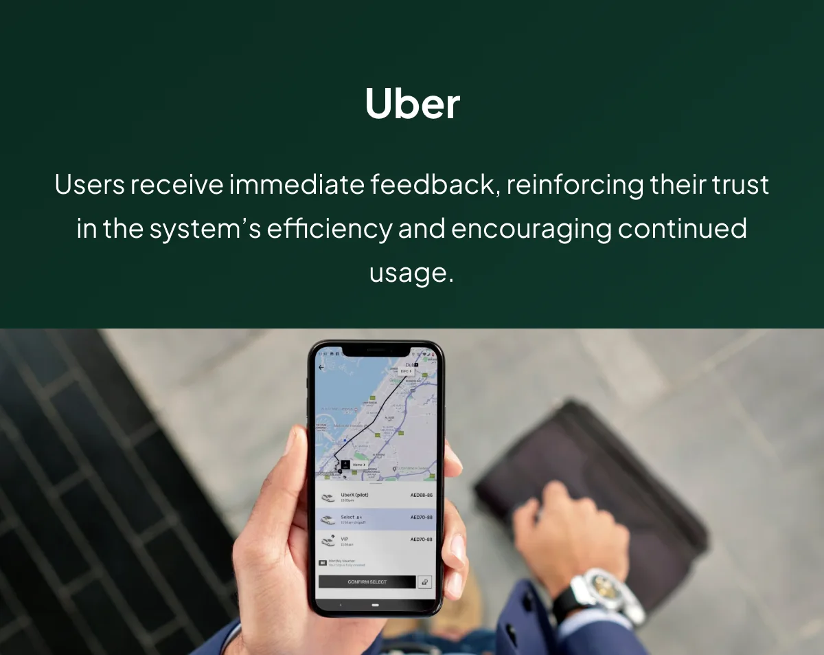
Uber’s Booking Process
WhatsApp’s forte is instant message delivery, which facilitates real-time communication.
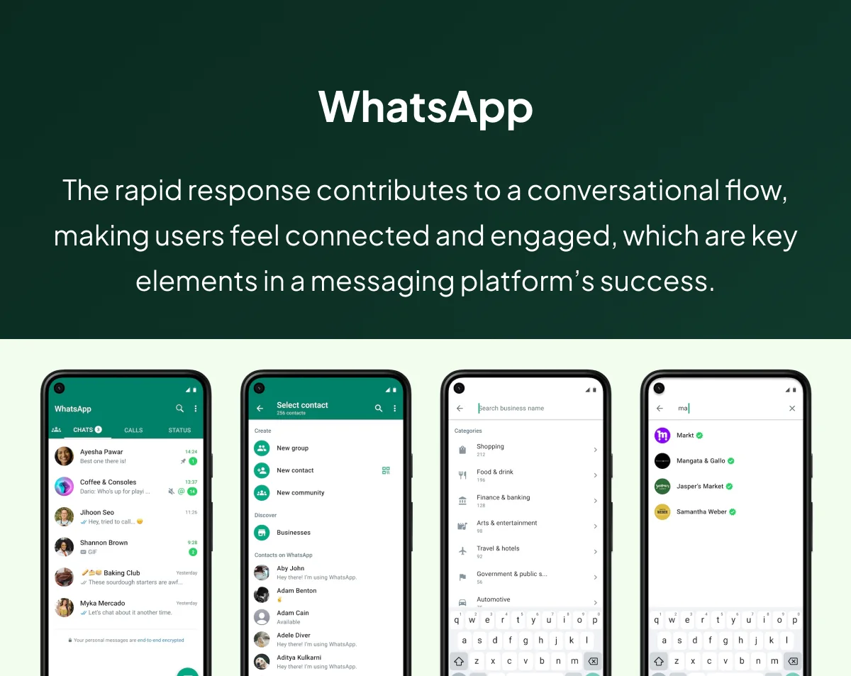
WhatsApp Messaging UX
Instagram prioritizes fast content loading, ensuring users can browse and engage with visual content swiftly.
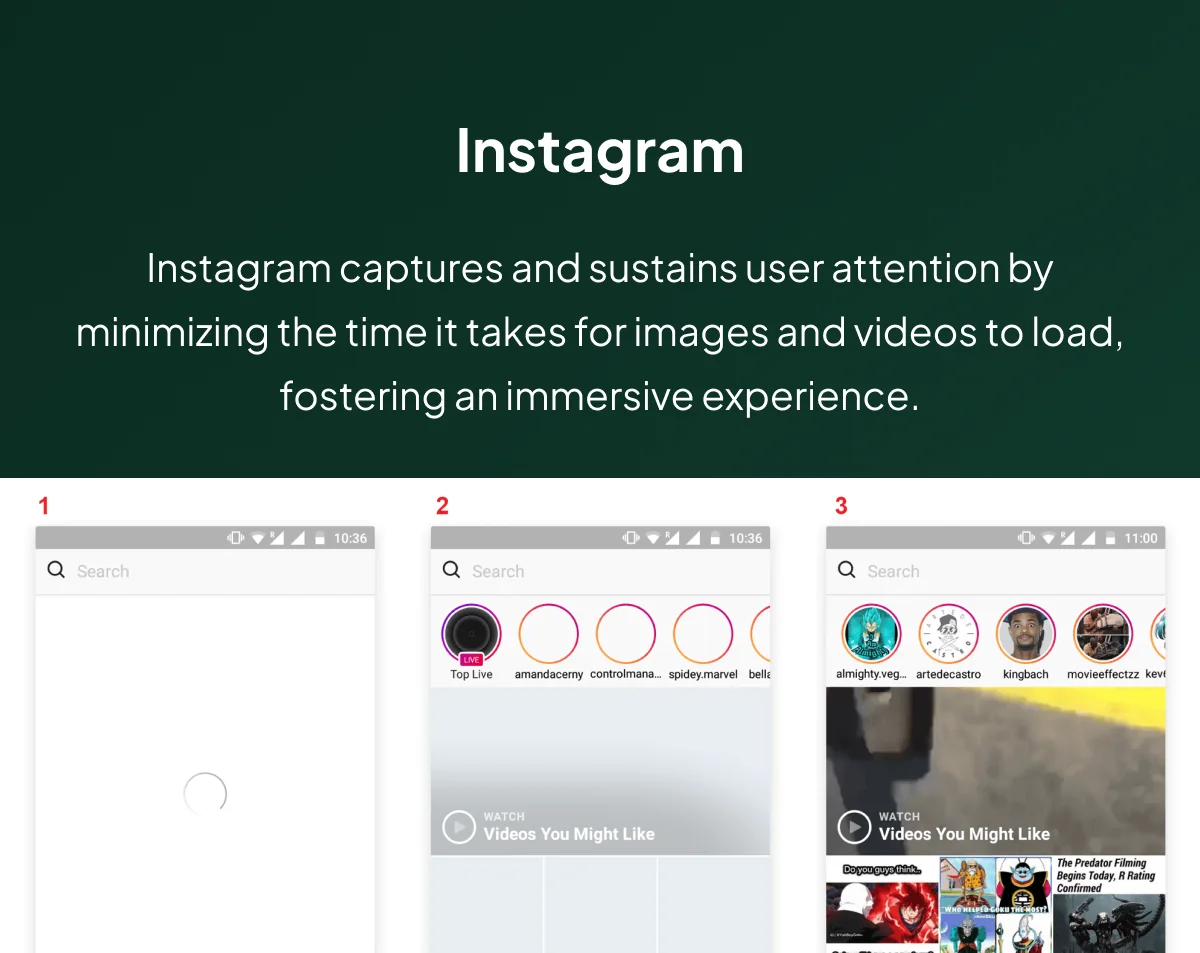
Instagram Loading Process
These examples showcase how adherence to the Doherty Threshold enhances user experiences, from turning potential wait times into engaging moments to ensuring smooth communication and swift access to content.
Conclusion
In the dynamic landscape of UX design, getting right the Doherty Threshold is not just a recommendation; it’s a user experience commandment. By prioritizing swift interactions, perceived performance, and adaptive design, designers can craft smooth, engaging interfaces that resonate with users. The Doherty Threshold remains a durable principle, ensuring user satisfaction remains paramount as technology evolves.
User Experience Consultancy at Olively
Feel free to reach out if you seek further guidance on implementing these principles into your product design endeavors.I work with teams on decisions like this one.
For more insights and updates on UX design, follow me here and on my LinkedIn page. Stay tuned for the latest in user experience innovation and design strategies.
If you're weighing a decision like this on a live product, here's how I work with teams.
Part of the UX laws worth knowing — seventeen principles grouped by the decision each one helps you make.
Cutting enterprise change requests 15 to 7 minutes — response time treated as a scope decision rather than an engineering one.
Common questions
What is the Doherty Threshold?
Interaction has to happen within about 400 milliseconds for attention to hold. Above that, the delay becomes noticeable and engagement starts to leak away.
Why does 400ms matter?
Below it, a person and the system stay in a loop that feels continuous. Above it, the pause is long enough to break concentration, and the interface starts to feel like something being waited on.
What if a task genuinely takes longer than 400ms?
Perceived performance can be managed even when actual performance cannot. Visual feedback — a skeleton screen, a progress indicator, an optimistic update — masks processing time and keeps the interaction feeling responsive.