Archive · Insurance
Sola: bridging the gap, one disaster at a time
Brand identity, marketing site and web app for Sola, a supplemental insurance startup paying out to homeowners hit by natural disasters.
This is earlier work, kept here because people still find it. The role titles below describe each engagement at the time. Olively today is an AI product consultancy — if that is what you are after, start with the AI Reality Check or the readiness scorecard.
The problem
What the work was actually for.
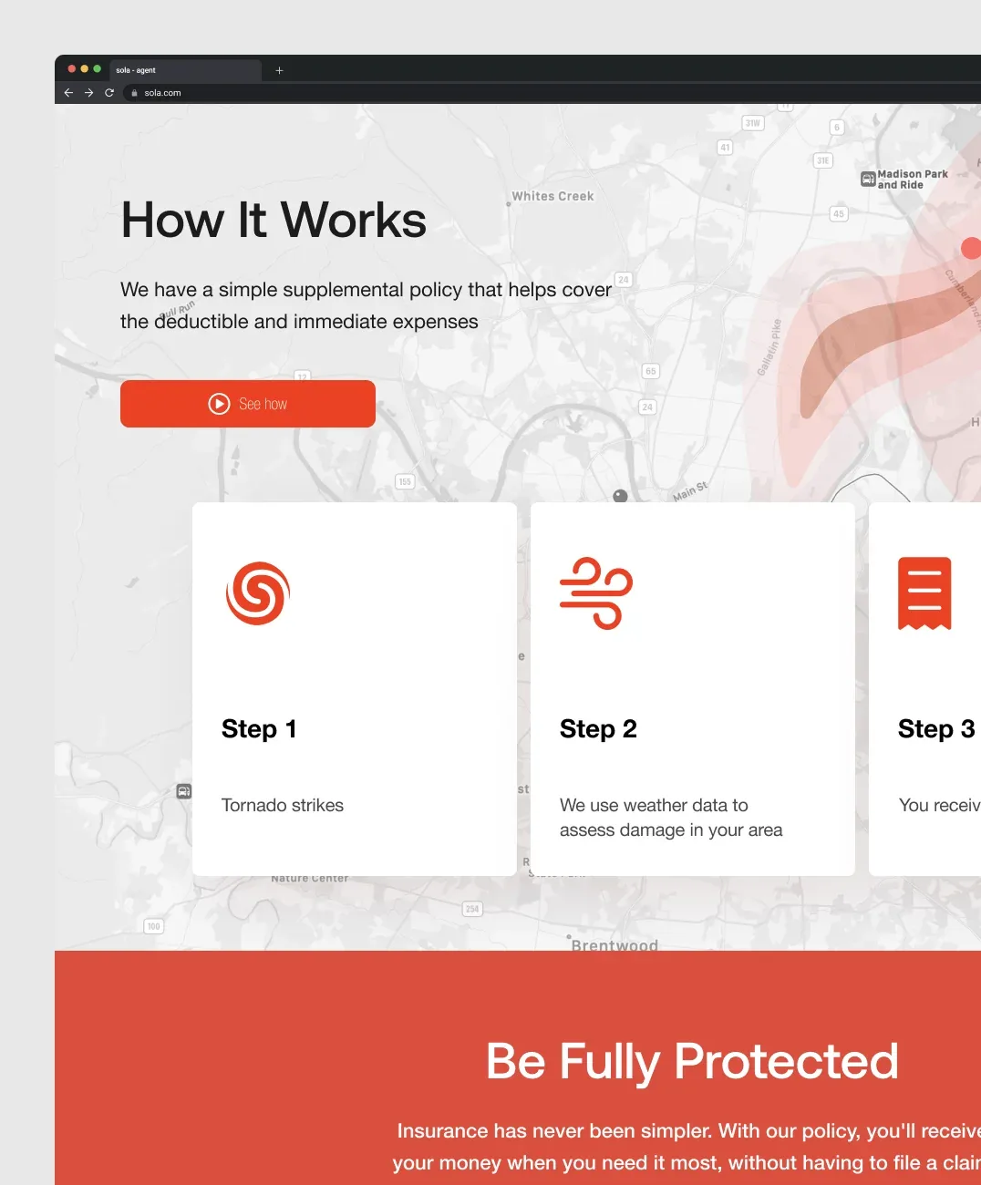
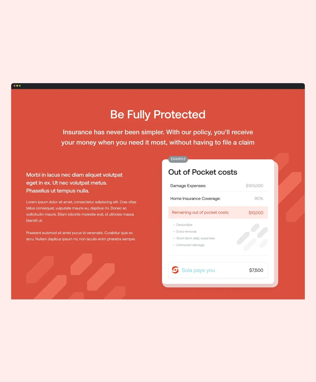
Sola pays homeowners quickly after a natural disaster — predominantly tornadoes — using data rather than an adjuster's visit to decide the payout. The product is genuinely fast. The website did not say so.
The brief was to make the speed and simplicity of the payout legible to two audiences at once: homeowners who have just lost a roof, and the insurance partner agents who sell the policy.
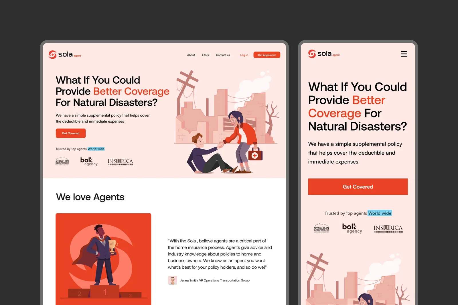
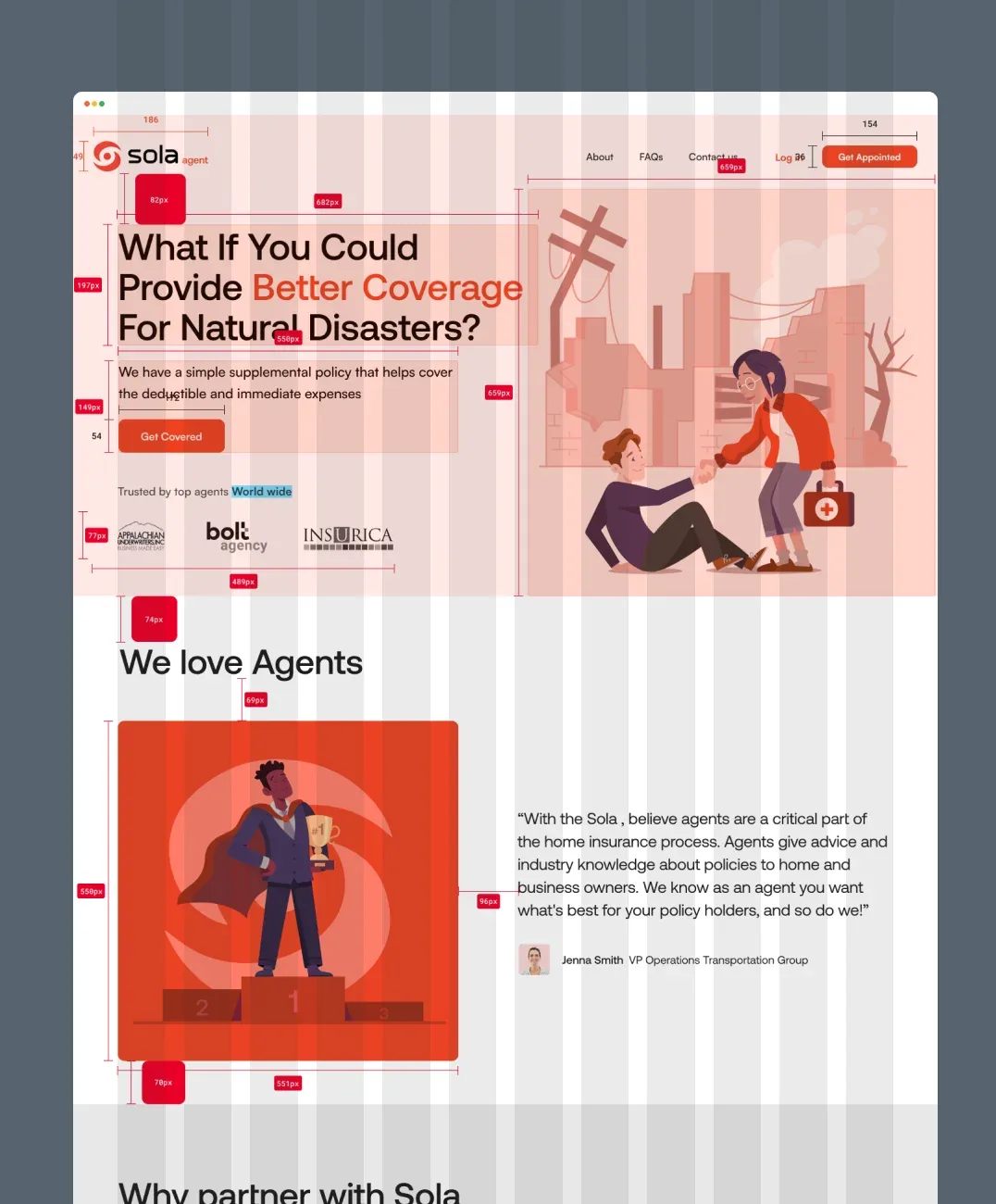
The marketing page redesign lifted conversions 25% on its own. A hero animation carries the story, the layout stays clean, and the calls to action assume the reader is not browsing for pleasure — they have probably just lost a roof.
The outcome
What actually changed.
Traffic rose 95%, page visits 53%, and average visit duration doubled. The marketing page redesign lifted conversions 25%. For a product bought under stress, holding attention twice as long is the result that matters most.
The decisions
Three calls that shaped it.
Choose orange over the category default
Every insurer reaches for blue. Orange was chosen to read as safety and warmth rather than institutional distance, for a product bought on the worst day of someone’s year.
Make the speed of the payout legible
The product genuinely is fast — data decides the payout rather than an adjuster’s visit. The site was not saying so, which is the entire gap the work closed.
Serve homeowners and partner agents on one page
Two audiences with different questions: one has lost a roof, the other sells the policy. The layout answers both without diluting either.
What was hard
Three weeks, covering logo, brand identity, marketing site and web app. The compression was survivable because the emotional register was agreed first, which is what most of the decisions then answered to.
The work
What it looked like.
Logo
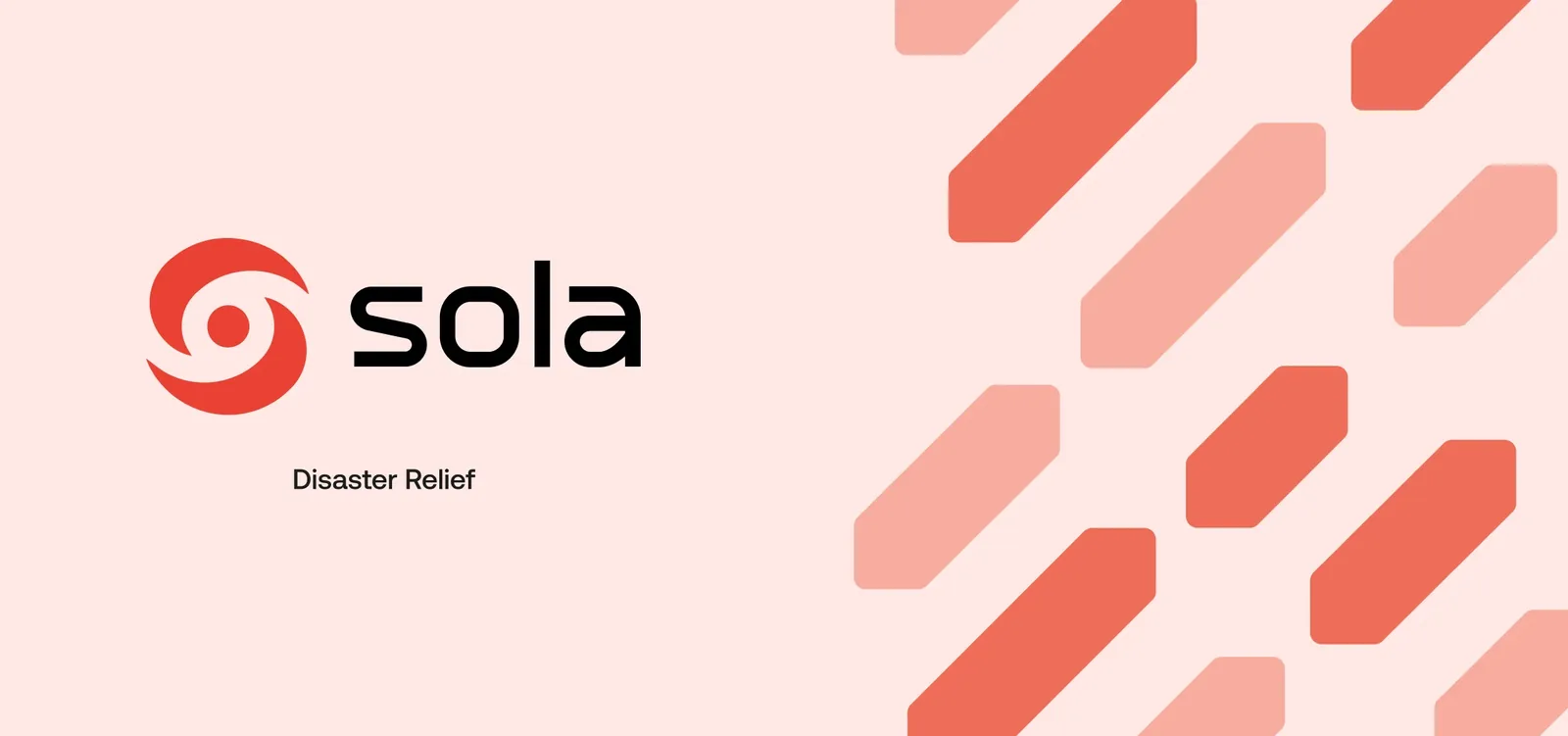
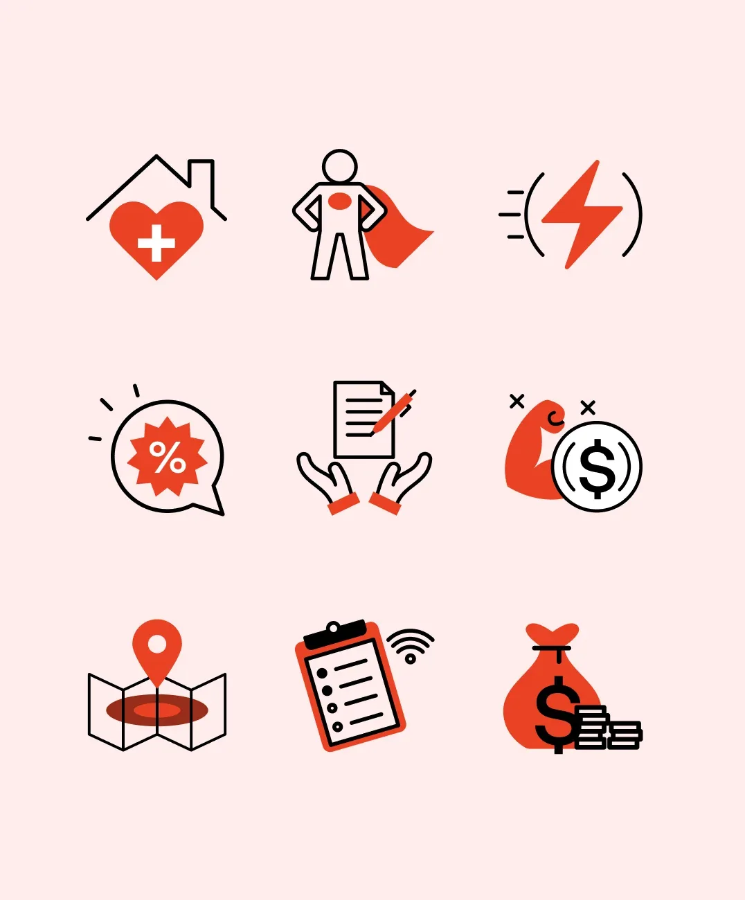
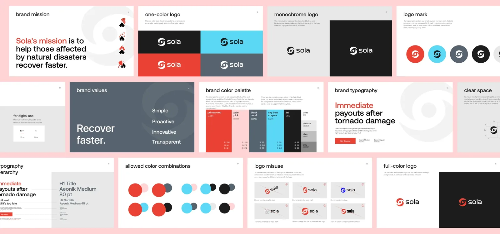
Sola’s values turned into a mark. The redesign had to work on a policy document, a claim email and a billboard, and read as reassurance in all three.
Brand identity
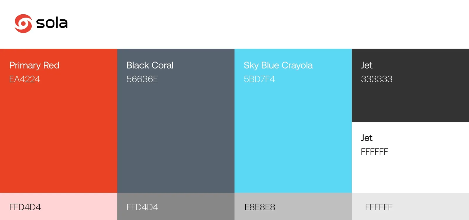
A bold orange rather than the blue every insurer defaults to — chosen to read as safety and warmth rather than institutional distance.
Marketing website
A hero animation telling the story, a clean layout, and calls to action that assume the reader is not browsing for pleasure. Conversions rose 25%.
Web app
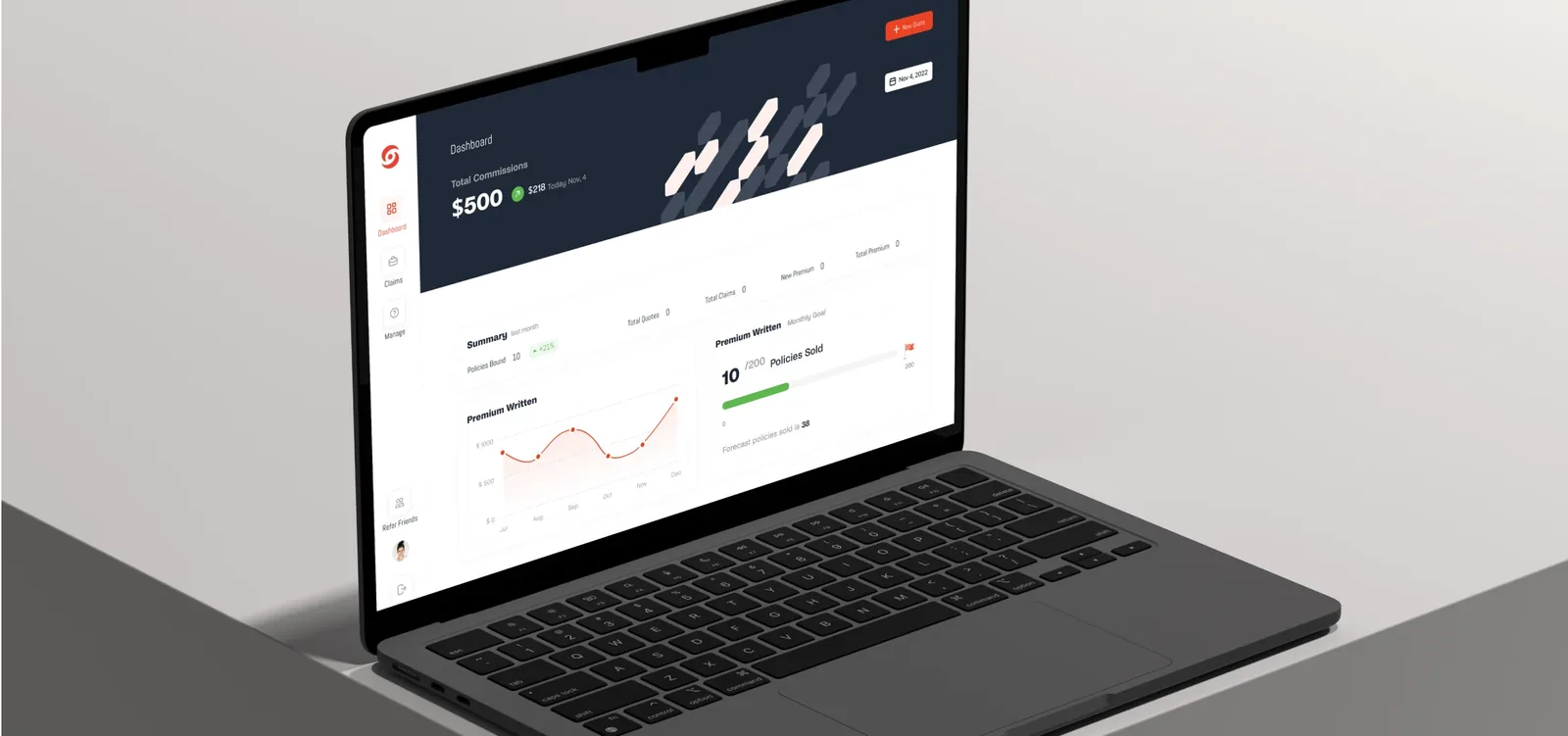
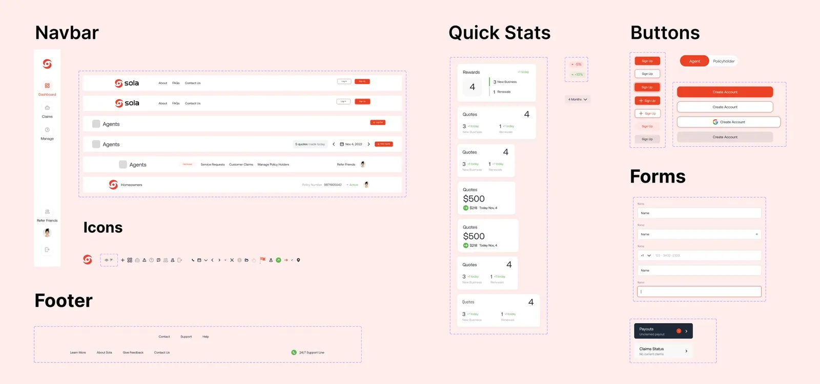
Claim and payout, designed for someone using it on the worst day of their year. Every unnecessary step is a cruelty here.
What I do now
Most AI projects are theatre. I help you build the ones that aren’t.
An AI Reality Check scores every idea on your roadmap and hands back three lists — what is real, what is theatre, and what is blocked. One week, fixed price.