Archive · Healthcare
Patient-centric healthcare web experience
A website redesign for Hearing and Audiology, a Western Australian clinic, tested with 500 participants and measured on booking activation.
This is earlier work, kept here because people still find it. The role titles below describe each engagement at the time. Olively today is an AI product consultancy — if that is what you are after, start with the AI Reality Check or the readiness scorecard.
The problem
What the work was actually for.
Hearing and Audiology has been running since 1985, the first private clinic of its kind in Western Australia. The website was not keeping up: low conversion, outdated design, and an incomplete picture of the services and devices actually on offer.
The audience makes this harder than a normal redesign. People arriving here often have a hearing impairment, are frequently older, and are researching a condition they may not fully understand. Accessibility is not a checkbox on this project, it is the brief.
The outcome
What actually changed.
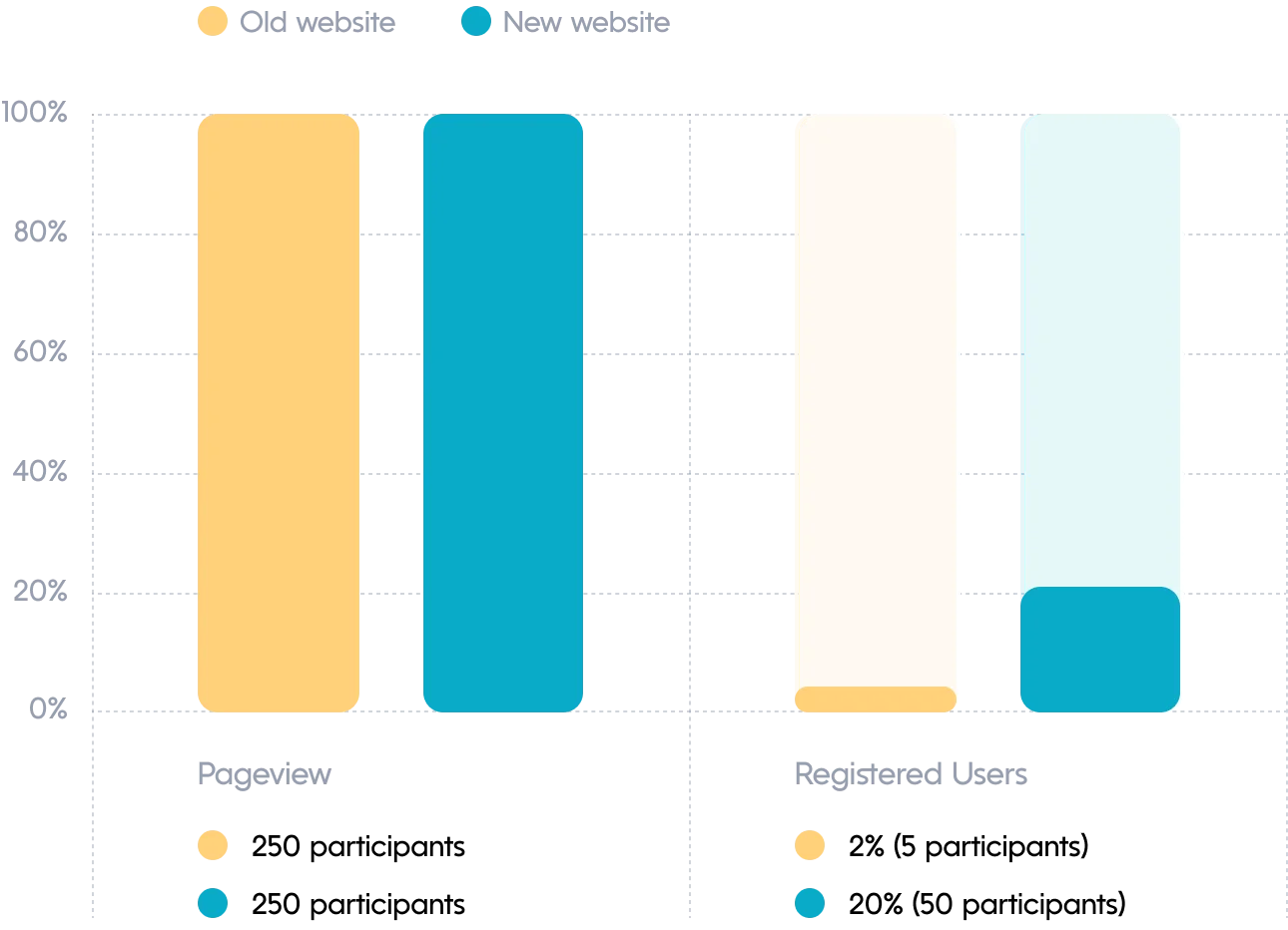
An 18% increase in activation on the booking process, measured against the old site with an average of 500 participants per test. Usability testing showed 100% task success on booking an appointment, in 40 seconds with zero errors.
The decisions
Three calls that shaped it.
Set the product personality against the category
Audiology defaults to serious and clinical. This was built nurturing and slightly whimsical instead, because the people arriving are anxious and researching a condition they may not understand.
Design for the impairment, not around it
The audience often has hearing loss and skews older. Accessibility was the brief rather than a checklist item at the end.
Measure activation, not traffic
The number that mattered was whether someone booked. Multivariate tests in PostHog compared old against new with an average of 500 participants.
What was hard
Fourteen days, three people, and an existing site with low conversion and outdated information. The scope was controlled by breaking the work into distinct subtasks rather than attempting a full rebuild.
Worth pointing at
A few decisions that held up.
User-centricity
Decisions grounded in what users said they needed, with feedback solicited repeatedly rather than once at the start.
Clarity and simplicity
Minimal cognitive load, because someone researching hearing loss is already dealing with enough.
Visual consistency
One colour scheme, one type system, one icon set — recognisability builds trust in a medical context.
Empathetic design
Auditory health is emotional territory. Visuals and language chosen to be comforting rather than clinical.
The work
What it looked like.
The interface
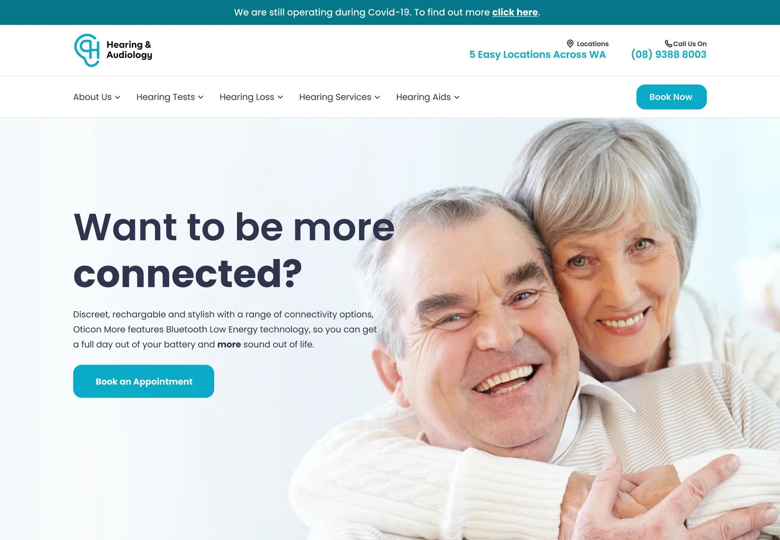
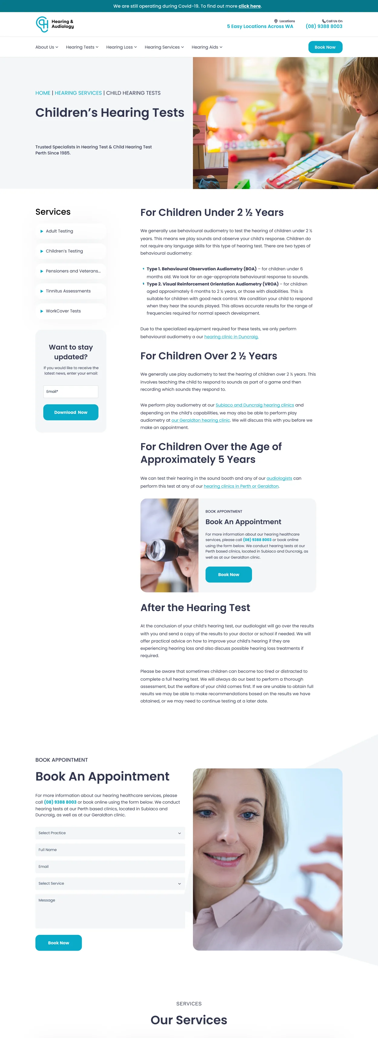
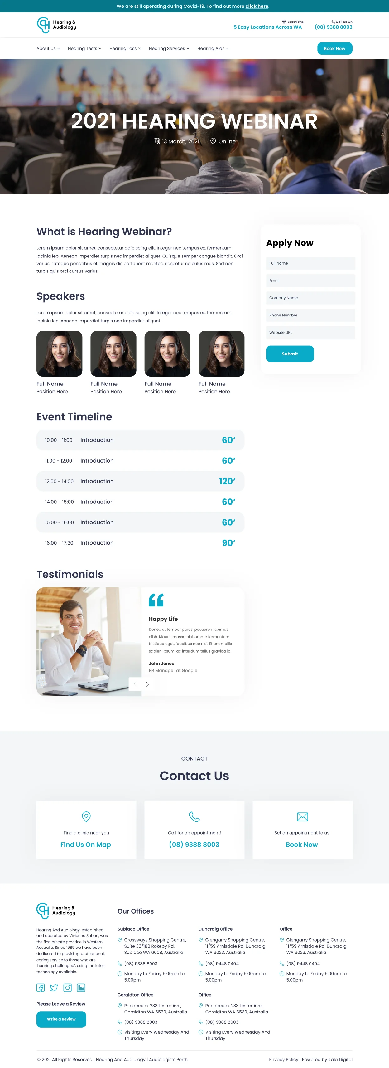
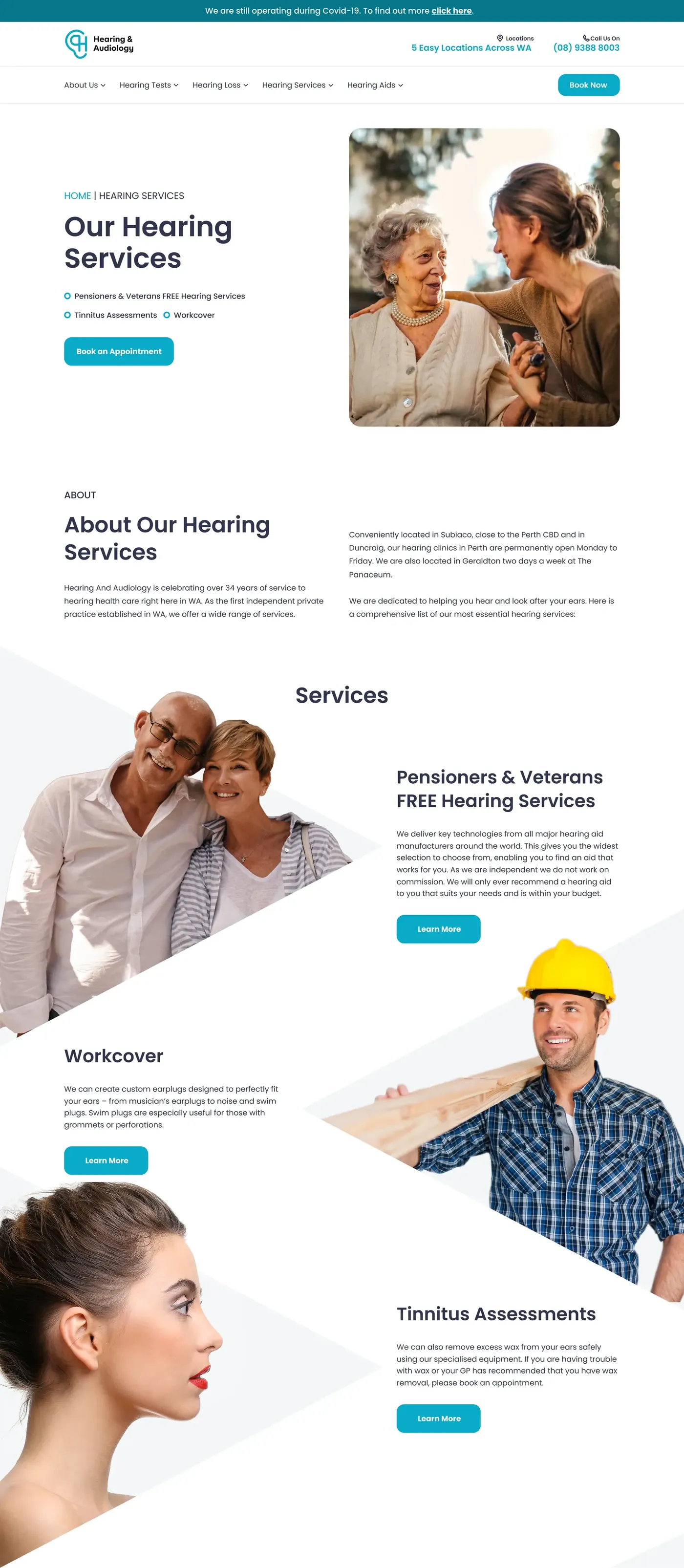
The product personality was set as nurturing and slightly whimsical — deliberately unlike the serious, exclusive register audiology usually adopts. For a clinic whose patients are often anxious, that choice does more work than any layout decision.


Results
Measured rather than asserted: activation rate compared old site against new, using multivariate tests in PostHog.
What I do now
Most AI projects are theatre. I help you build the ones that aren’t.
An AI Reality Check scores every idea on your roadmap and hands back three lists — what is real, what is theatre, and what is blocked. One week, fixed price.