Archive · Fintech
Fintech Figma Design System
A design system for Canua, built alongside branding and visual identity, using Aarron Walter's emotion-driven design methodology.
This is earlier work, kept here because people still find it. The role titles below describe each engagement at the time. Olively today is an AI product consultancy — if that is what you are after, start with the AI Reality Check or the readiness scorecard.
The problem
What the work was actually for.
Integrating multiple open banking APIs such as Plaid started as a custom icon job. It became clear the same problem ran through every component, so it turned into a full design system.
Two goals. Speed up designing and engineering by making pages and complex components quick to build and replicate. And establish one language across cross-functional teams, so the interface stayed visually consistent as it grew.
It ran in stages: a style guide first, then a component library of individual UI elements, then a pattern library holding groupings and layouts.
It ran in three stages, each of which had to be finished before the next was worth starting: a style guide, then a component library of individual elements, then a pattern library holding groupings and whole page layouts.
The outcome
What actually changed.
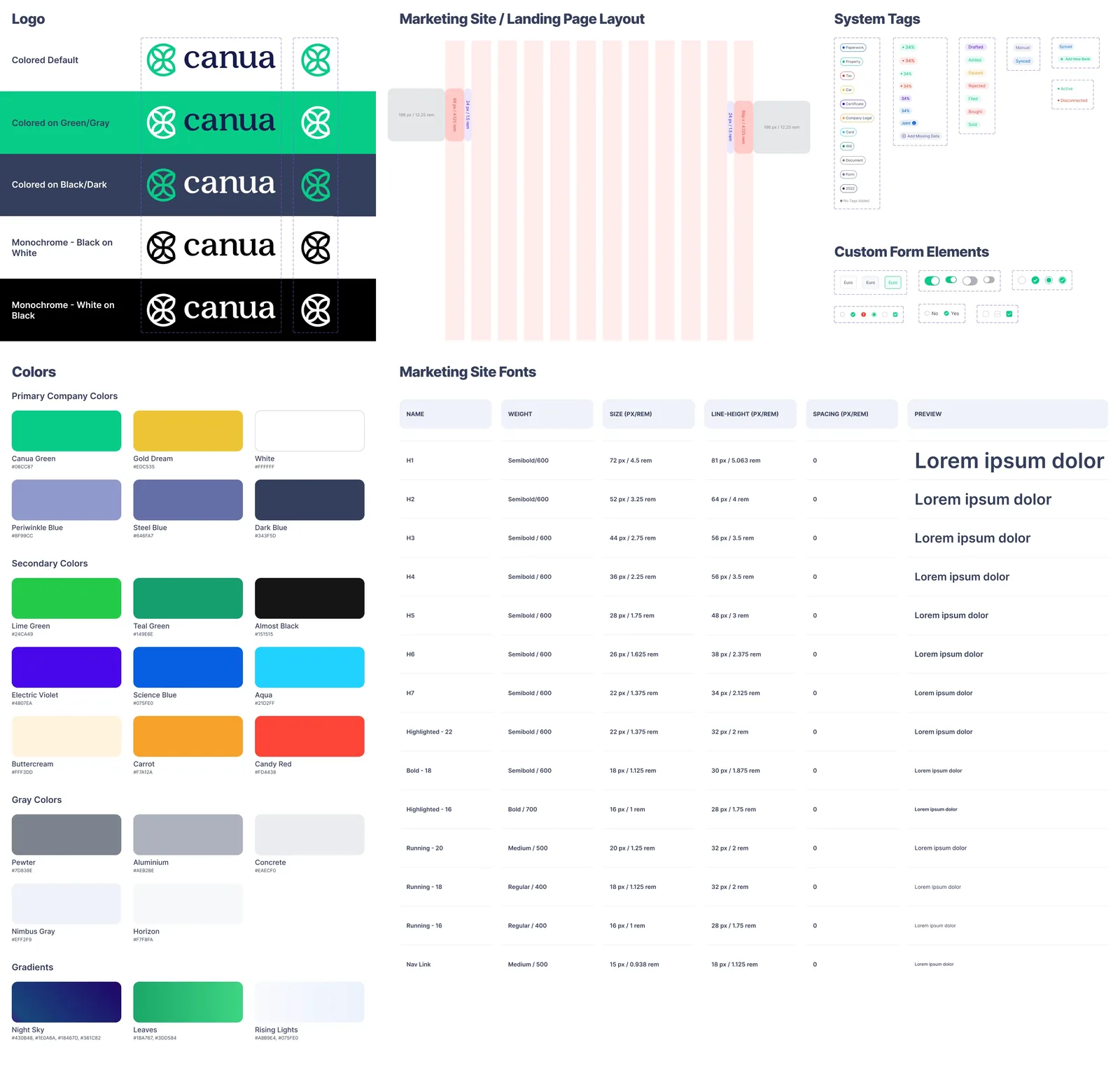
1,728 components and 915 icons, documented in Zeroheight with code snippets alongside. The point was not the count. It was that design and engineering stopped renegotiating the same button every sprint, and a new page could be assembled rather than drawn.
The decisions
Three calls that shaped it.
Icons first, because that was the real bottleneck
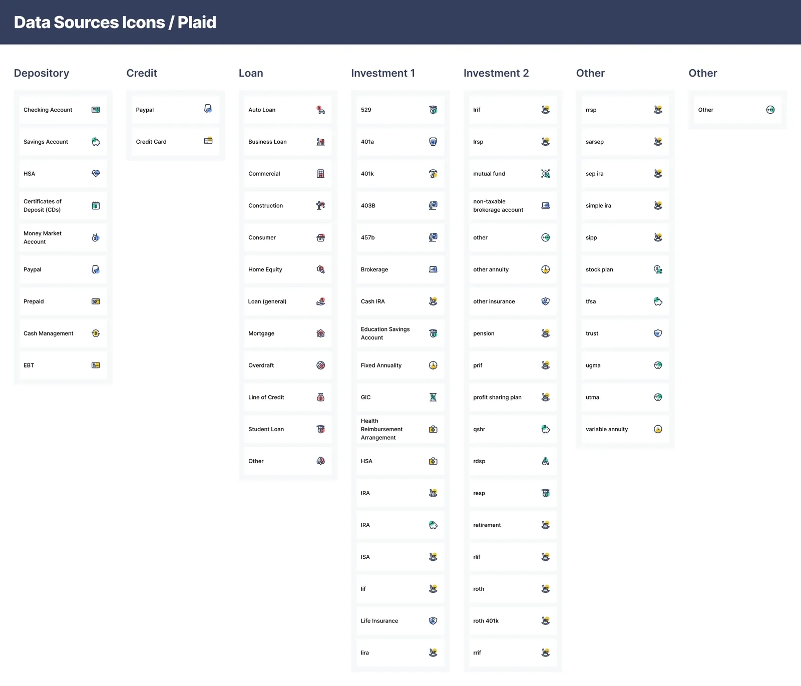
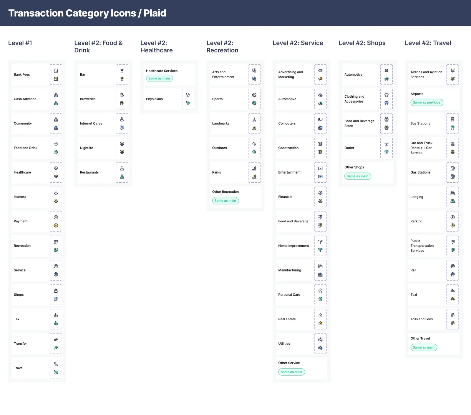
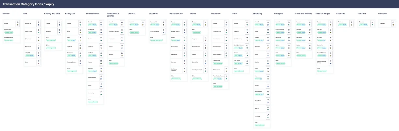
The job started as a custom icon request for open banking categories. Plaid and Yapily categorise transactions differently, so covering both without the interface looking like two products was the actual problem underneath.
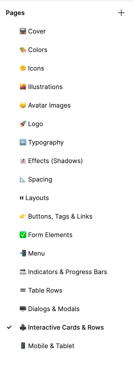
Figma and Zeroheight, chosen on developer preference
Research into how the engineers actually worked decided the tooling, rather than what was comfortable to design in. Components were structured to their conventions so handover stopped being a translation exercise.
Simple components before complex ones
Buttons and menu items were built first. They are unglamorous, but they are what makes a design process faster earliest, and speed early is what stops a system being abandoned.
What was hard
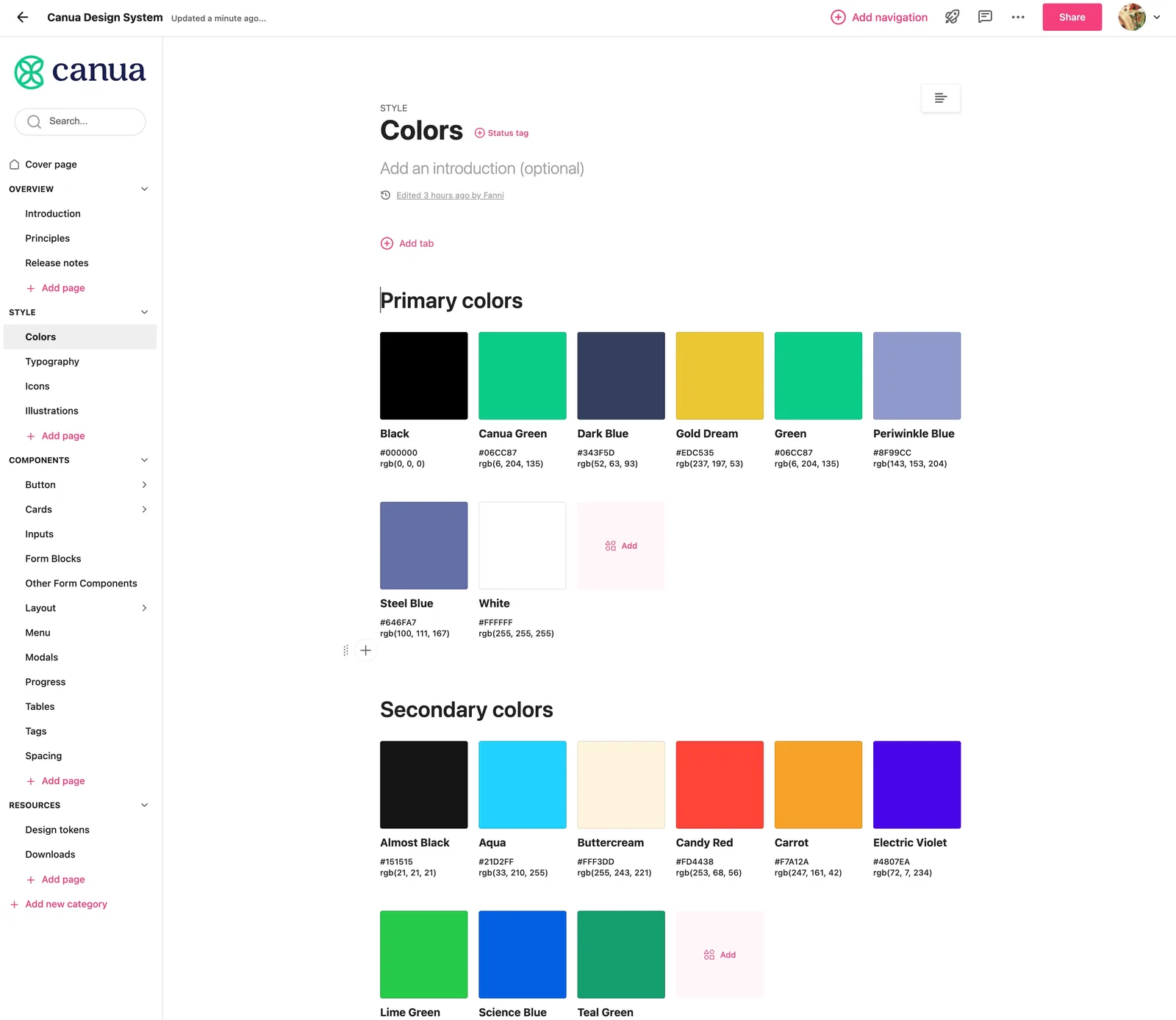
1,728 components and 915 icons is a number that can mean a system nobody uses. What made it hold was the Zeroheight documentation with code snippets alongside, so a developer could copy rather than interpret.
The work
What it looked like.
Icons
Every income and expense category across the integrated open banking APIs needed an icon. Plaid and Yapily categorise differently, so the set had to cover both without the interface looking like two products.
Component library
The simplest elements were built first — buttons, menu items — because those are what speed up a design process earliest.
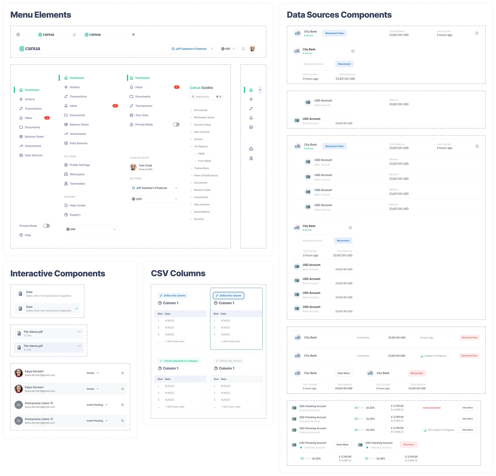
Pattern library
Groupings and layouts, from cards up to whole pages composed of components.
Figma and Zeroheight
Structured to developer preference rather than designer convenience, so handover stopped being a translation exercise.
What I do now
Most AI projects are theatre. I help you build the ones that aren’t.
An AI Reality Check scores every idea on your roadmap and hands back three lists — what is real, what is theatre, and what is blocked. One week, fixed price.