Archive · Fintech
Column Tax: embedded tax experiences
A brand, design system and product interface for Column Tax, whose APIs put income tax filing inside other financial apps.
This is earlier work, kept here because people still find it. The role titles below describe each engagement at the time. Olively today is an AI product consultancy — if that is what you are after, start with the AI Reality Check or the readiness scorecard.
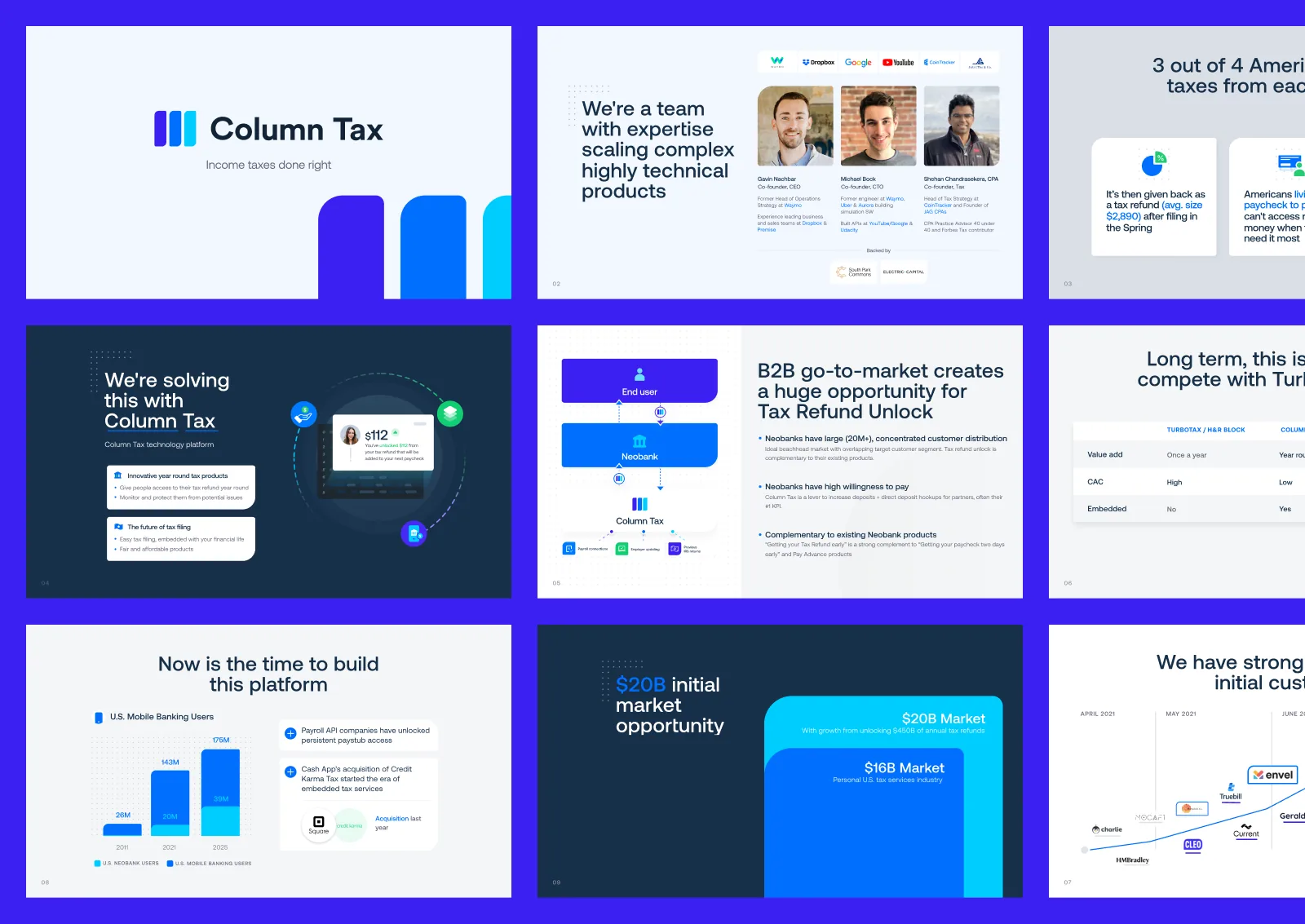
The problem
What the work was actually for.
Column Tax sells an API. Its interface has to live inside somebody else's financial app and still feel like it belongs there — which is a harder brief than designing a product that owns its own screen.
The mobile side mattered more than it usually would. A growing share of Americans file from a phone, and a filing flow that cannot be finished in one sitting on a small screen is a flow most people abandon partway and return to never.
That constraint shaped everything. The brand had to be simple enough to sit inside a partner's product without fighting it, and the interface had to make filing a tax return feel like a short task rather than an afternoon.
Three brand attributes were fixed before any design started: simplicity, modernity, trustworthiness. For tax software the third one carries the most weight — a product that looks careless with a page layout will not be trusted with a filing.
The outcome
What actually changed.
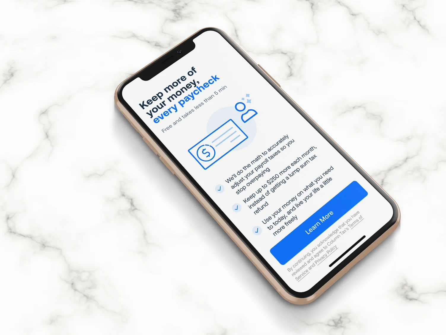
A tax return that can be set up and filed in under five minutes, and a brand simple enough to sit inside a partner's app without competing with it. For an API business, that second point is the product — if the design cannot disappear into someone else's interface, it cannot be sold.
The decisions
Three calls that shaped it.
Design a brand that can disappear
Column Tax sells an API, so its interface lives inside somebody else’s financial app. A brand that cannot sit inside a partner product without competing with it cannot be sold.
Filing in under five minutes on a phone
The target was set as a time, not a screen count, because the growing share of Americans filing on mobile will not finish anything longer.
Carry information visually rather than in text
For a product selling the removal of effort, dense blocks of copy contradict the pitch.
What was hard
Three attributes were fixed before any design started — simplicity, modernity, trustworthiness — in that order. Tax software that looks anything less than trustworthy does not get used, however elegant it is.
The work
What it looked like.
Design system
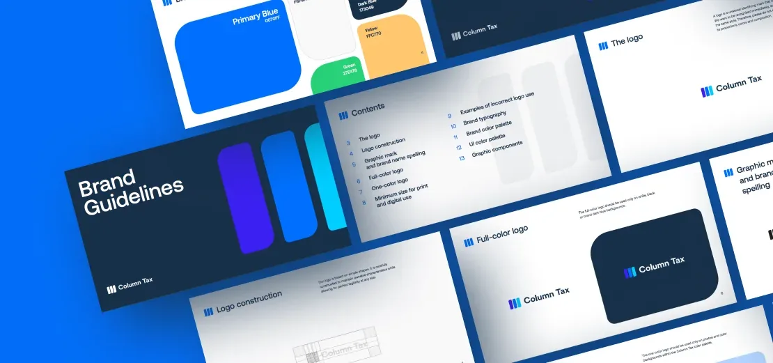
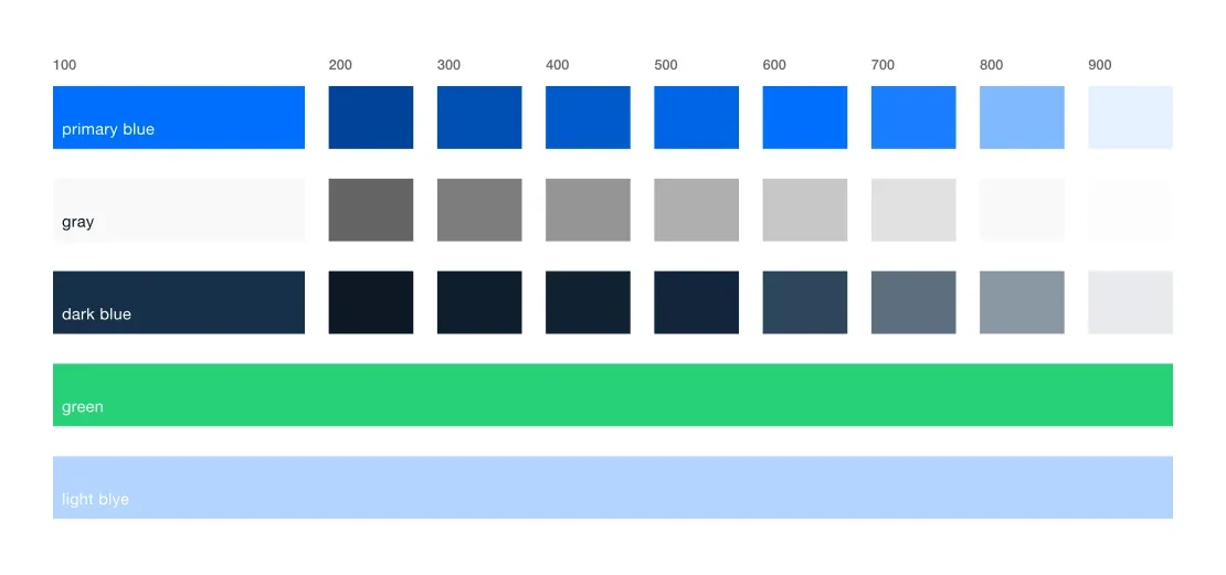
Simplicity, modernity and trustworthiness, in that order. A minimal palette chosen for contrast, and a component library a partner's team can use without a designer present.
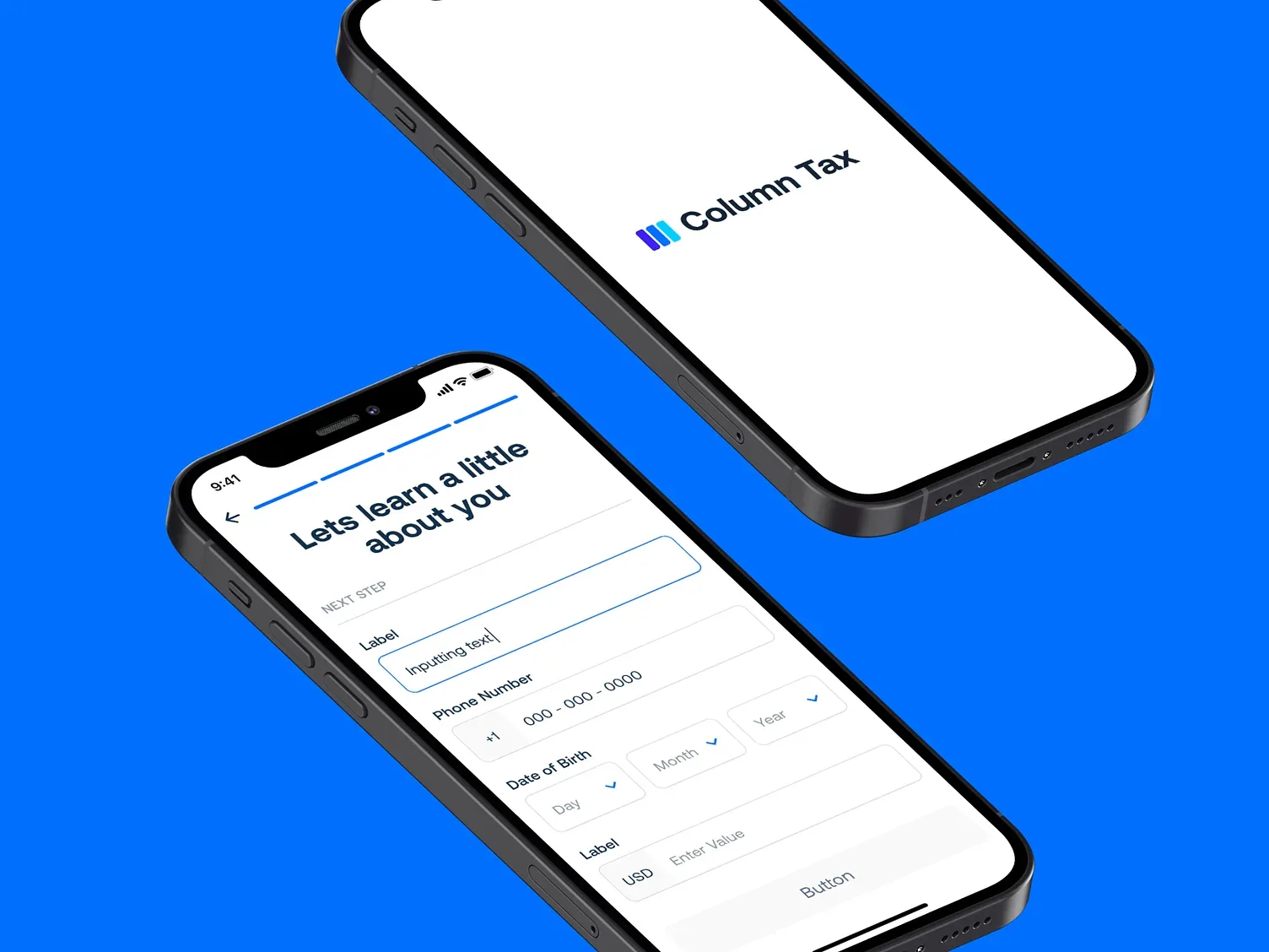
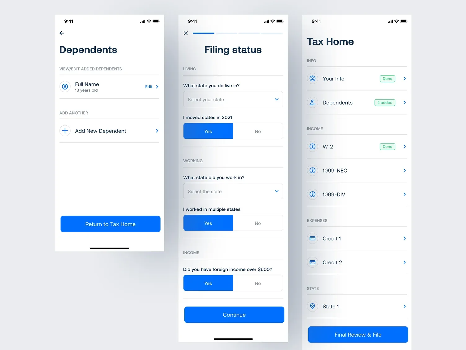
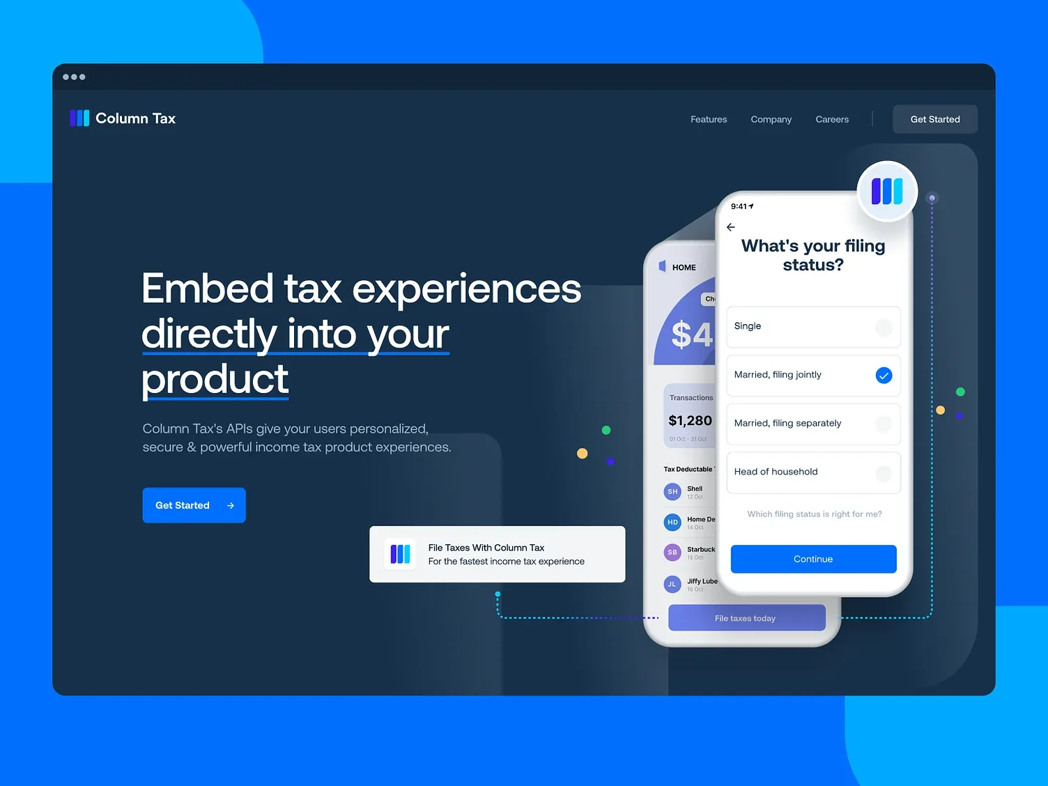
Website
High-end visuals carrying information that would otherwise be text. The site had to demonstrate the simplicity it was selling.
Mobile app
The whole filing flow, built to be finished in one sitting on a phone.





Brand
Brand architecture for a company whose logo often appears inside somebody else's product.
What I do now
Most AI projects are theatre. I help you build the ones that aren’t.
An AI Reality Check scores every idea on your roadmap and hands back three lists — what is real, what is theatre, and what is blocked. One week, fixed price.