Archive · Healthcare
Checkout conversion, from 0.4% to 9%
A checkout redesign for eXciteOSA, the first clinically proven daytime therapy for mild sleep apnoea, where final checkout conversion went from 0.4% to 9%.
This is earlier work, kept here because people still find it. The role titles below describe each engagement at the time. Olively today is an AI product consultancy — if that is what you are after, start with the AI Reality Check or the readiness scorecard.
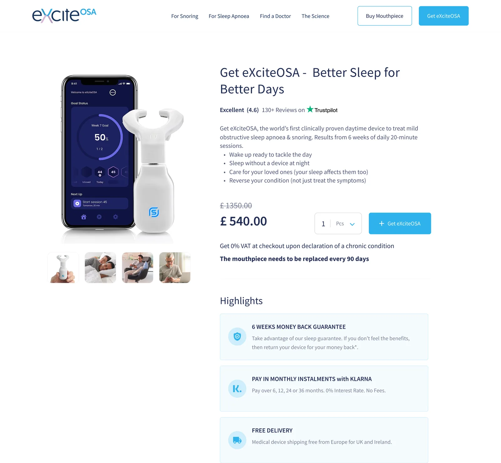
The problem
What the work was actually for.
eXciteOSA is a regulated medical device sold direct to consumers. That combination is unusual and difficult — the product needs the credibility of a medical device and the checkout of a shop, and the original site was failing at the second.
People were reaching the product page and leaving. The work began as an audit of Google Analytics and session recordings rather than as a redesign, because the first question was where exactly people were giving up.
The outcome
What actually changed.
Removing the intermediate cart step lifted overall conversion 78%. The UX changes took final checkout rate from 0.4% to 9% — a twenty-two-fold improvement, measured against the original data with an average of 1,200 participants per test. Sales rose 15% and cart conversion 46%.
The decisions
Three calls that shaped it.
Audit before redesigning
The work began with Google Analytics and session recordings, not with layouts. Nine specific findings came out of it, each tied to a place people were dropping out.
Delete the intermediate cart step
A screen between product and checkout that offered no information and no value. Removing it lifted overall conversion 78% — the largest single change on the project.
Show the real price before the expectation is set
VAT and shipping recalculated after a country was chosen later, so the total moved once the user had already anchored on a number. That is where trust goes.
What was hard
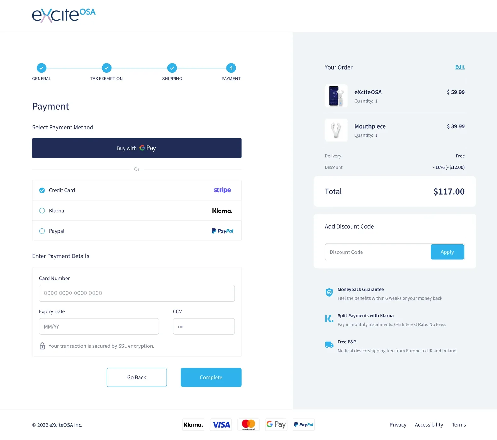
This is a regulated medical device sold direct to consumers. The payment section did not communicate trust, which for someone buying a health product from an unfamiliar site is not a cosmetic problem.
Worth pointing at
A few decisions that held up.
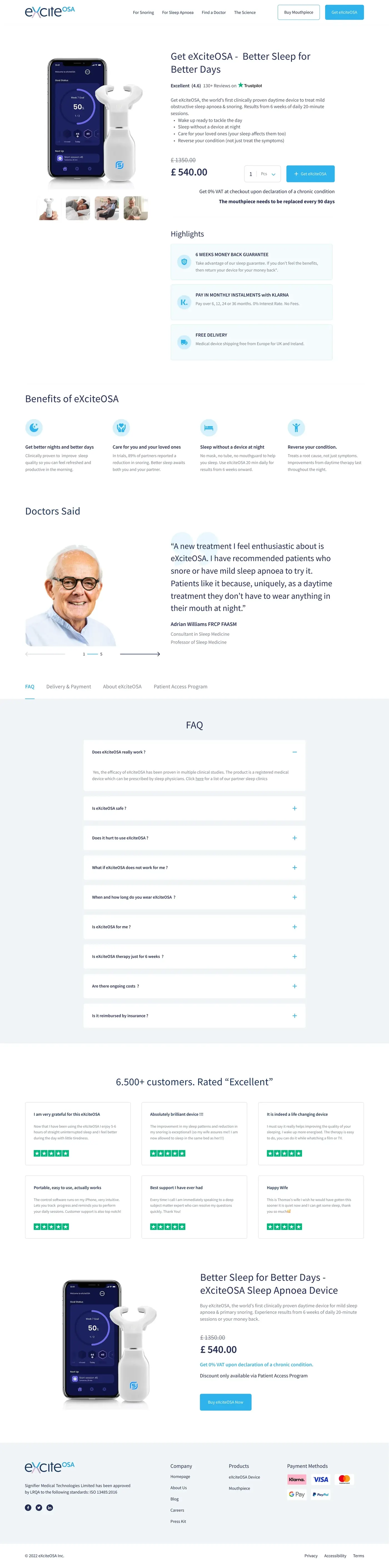
The menu vanished on the product page
Navigation disappeared exactly where people wanted to check a price and then research further. The 'add to basket' button did not stand out either.
The description sold features, not benefits
Text-heavy, technical, nothing highlighted, and no way to choose a quantity. Product information and checkout were not visually separated.
The money-back guarantee was buried
One of the strongest reasons to buy a medical device online sat far below the fold, blending into everything around it.
An intermediate screen that did nothing
A step between product and checkout offering no information and no value. Removing it was the single biggest win.
The price changed after the expectation was set
VAT and shipping recalculated based on a country selected later, so the total moved after the user had anchored on a number.
The payment section did not look trustworthy
For a regulated medical device bought by someone with a health condition, that is not a cosmetic problem.
The work
What it looked like.
The audit
Nine specific findings, each tied to a place people were dropping out. An audit that produces a general impression is worth nothing; this one produced a list you could build against.
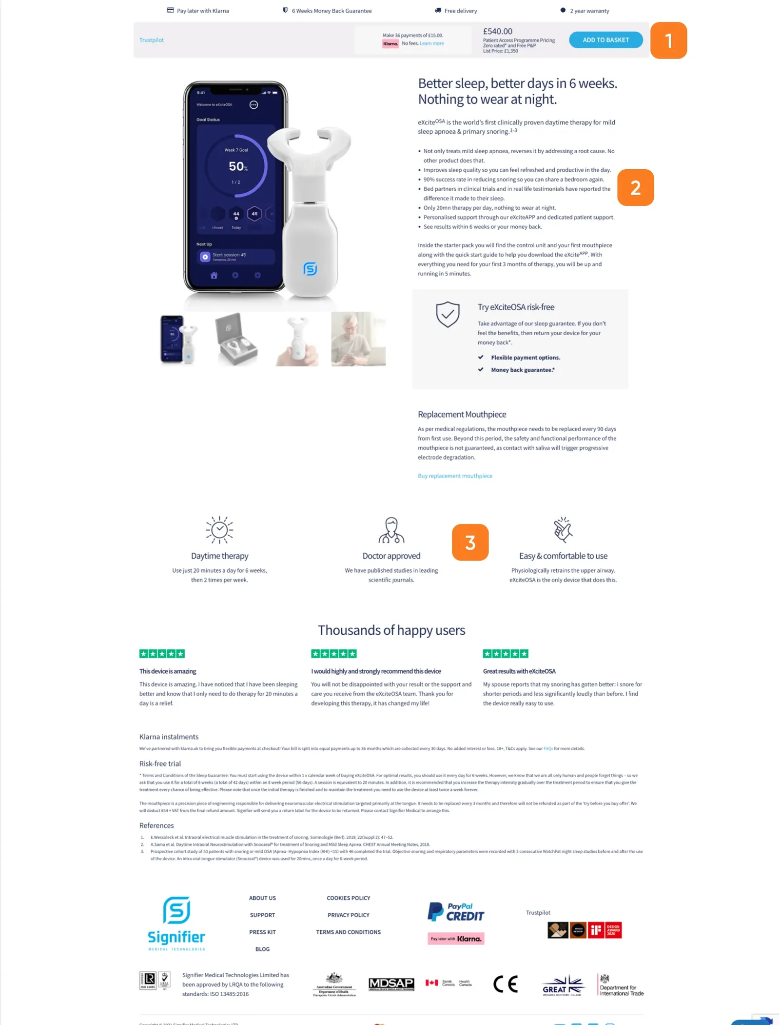
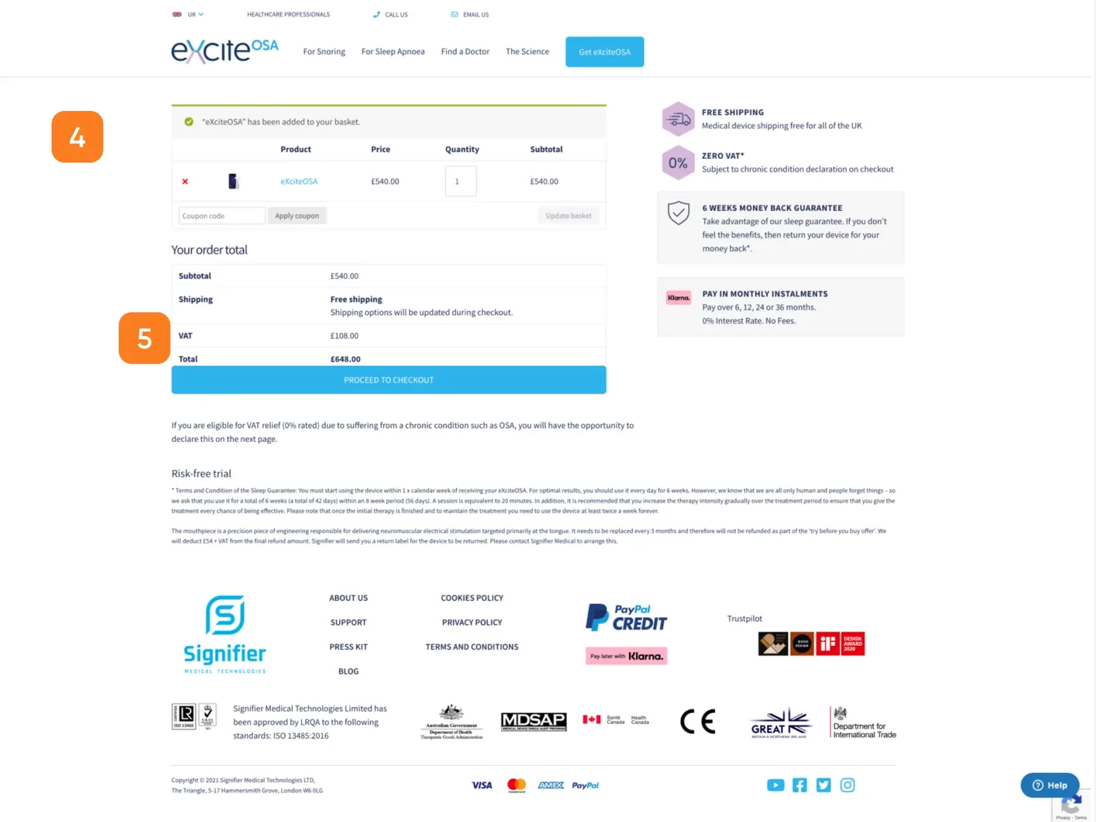
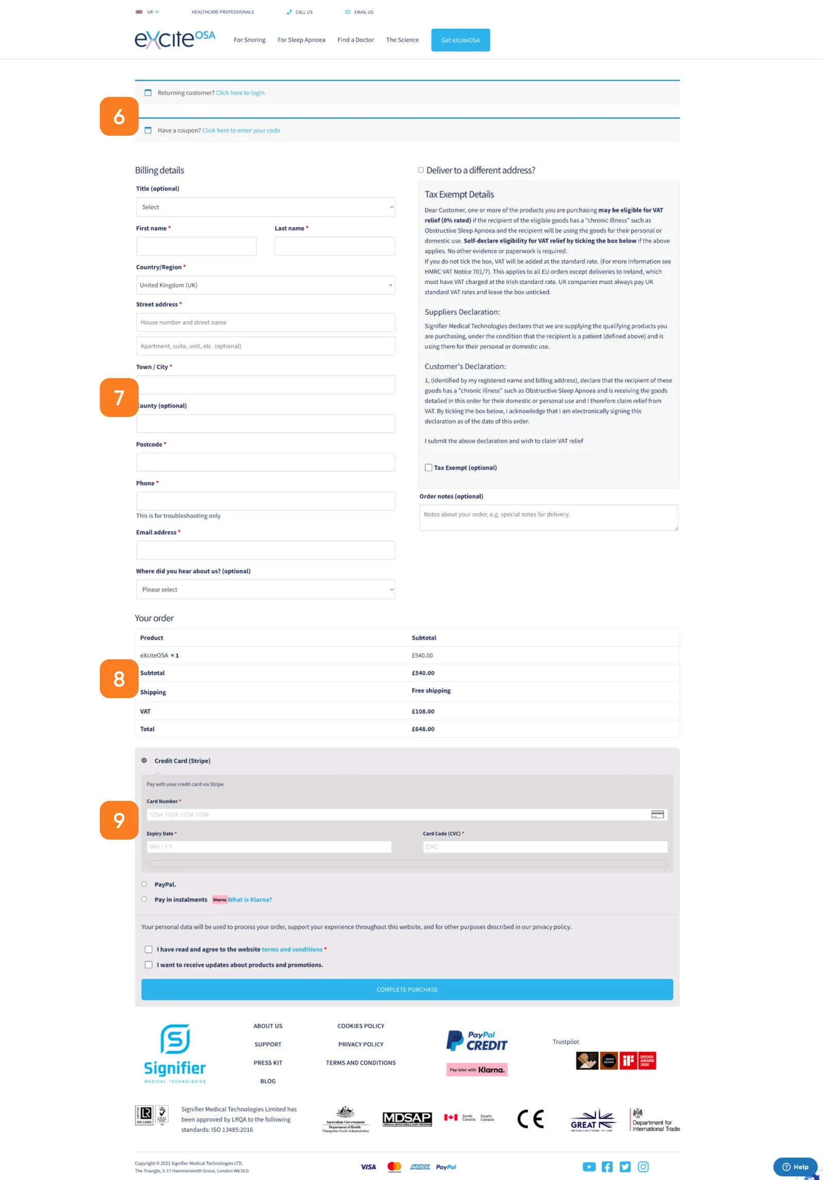
Wireframes
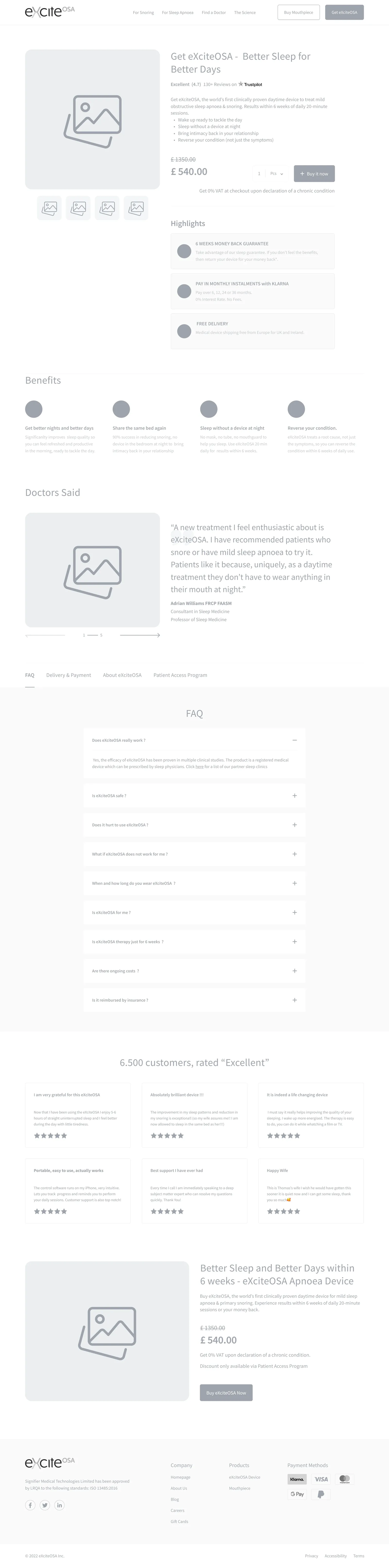
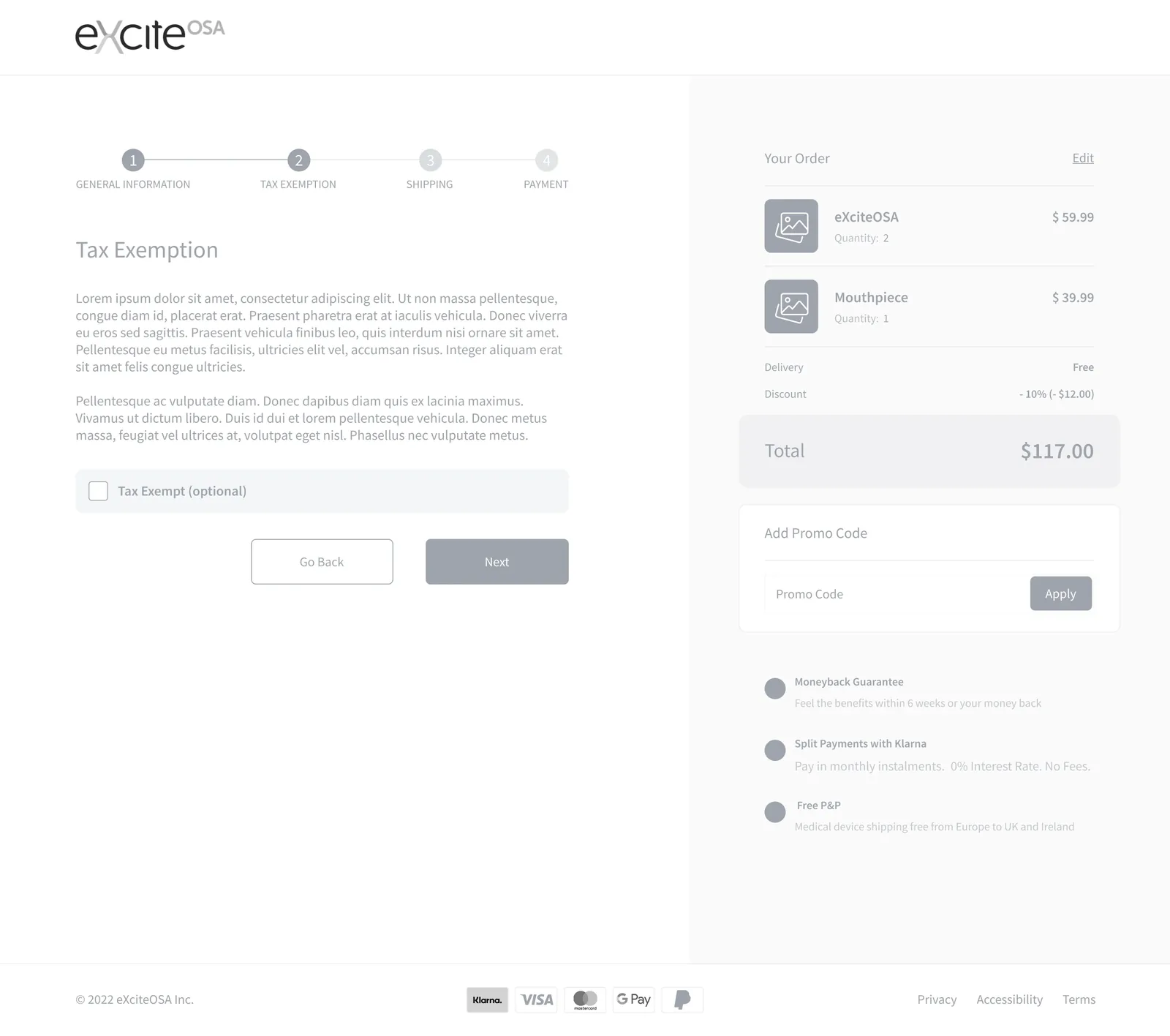
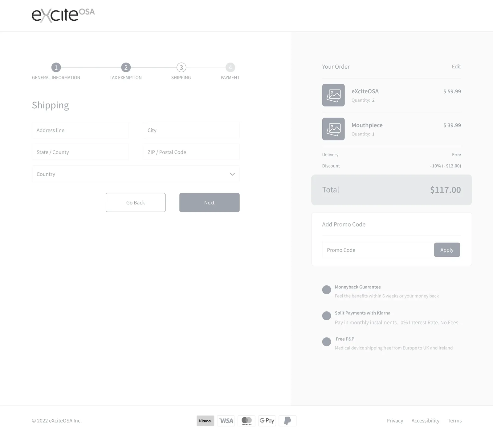
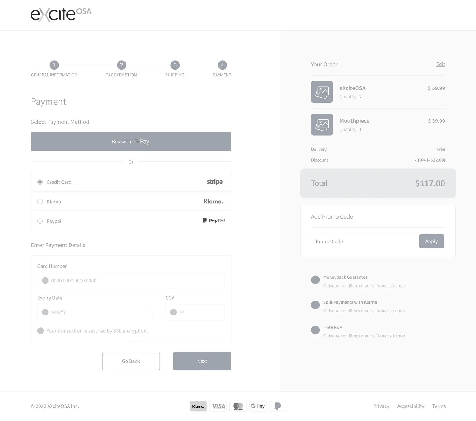
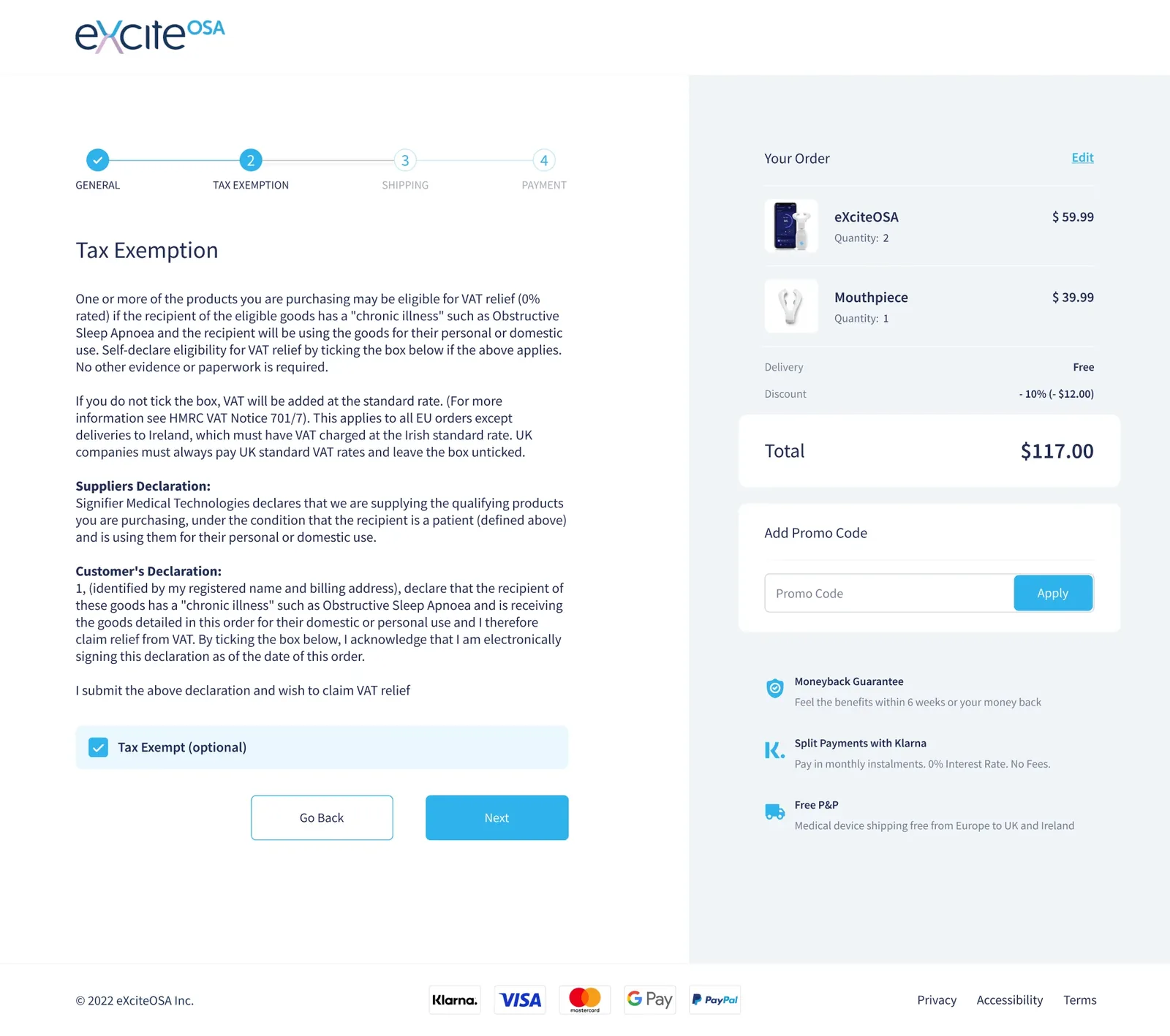
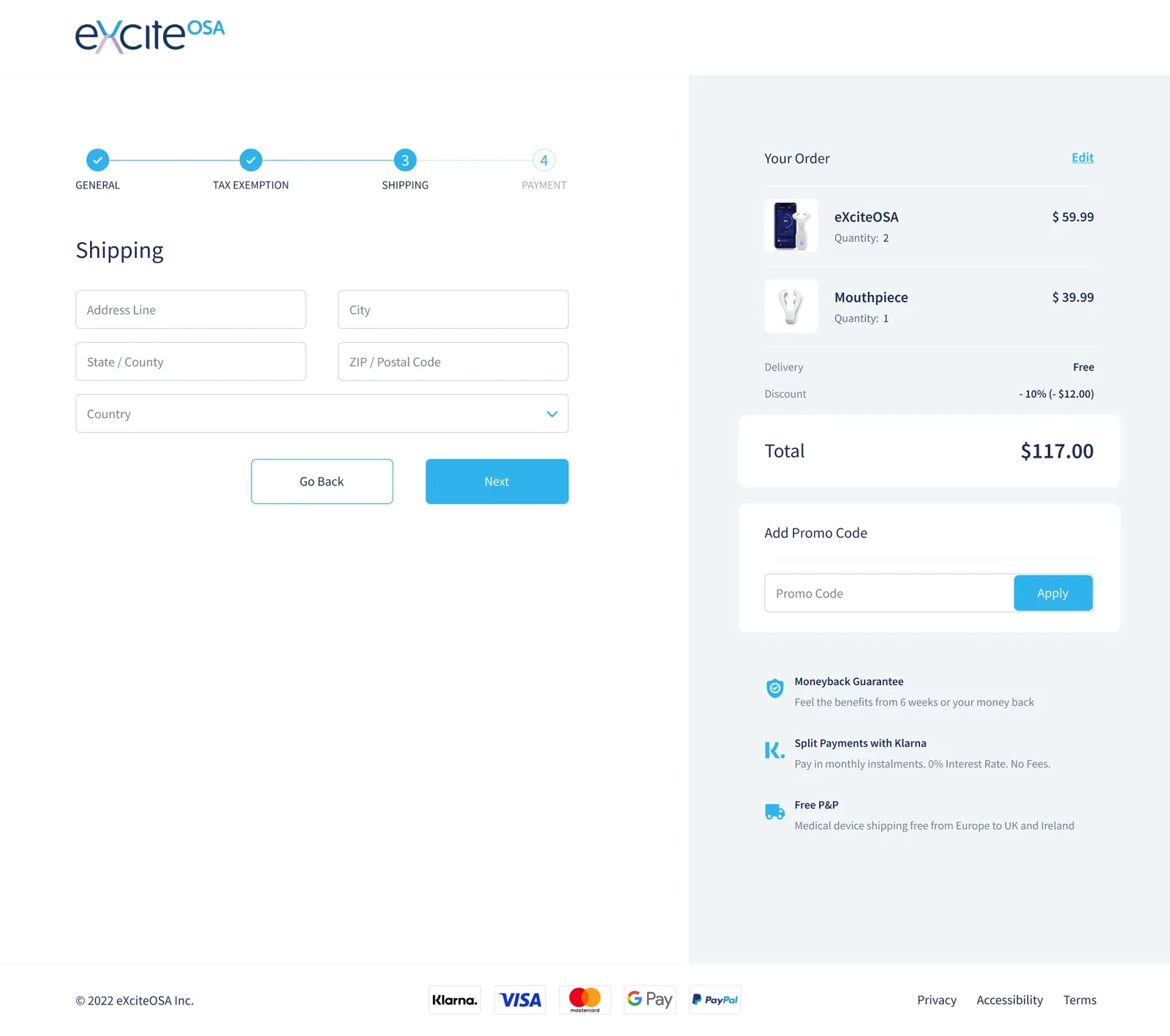
Product page, tax exemption, shipping, payment — the four screens where the money was being lost.
The interface
Desktop and mobile for each of the four screens, because the checkout problems looked different on a phone.
What I do now
Most AI projects are theatre. I help you build the ones that aren’t.
An AI Reality Check scores every idea on your roadmap and hands back three lists — what is real, what is theatre, and what is blocked. One week, fixed price.